Showing posts with label vintage style crafting. Show all posts

Friday, November 22, 2024

Magical Christmas Designs - Gecko Galz November 2024 Challenge


Welcome back to Paper Play, friends!

The fun part about this time of the year is that we celebrate so many holidays.  This month we've moved on from all things dark and beautiful to the magic of Christmas!  November's Gecko Galz Challenge theme was Magical Christmas designs.  This was a fun twist on the typical Christmas crafts since the word magical may be interpreted so many different ways.  I decided to focus on the magical beings of the season - elves, beings of nature, and angels.

I created four projects for the challenge - a tag and three greeting cards.  For the cards, I went with a theme of using a line from a Christmas song as the greeting.  I think that I found the perfect images to accommodate them!

For the tag, I used a chipboard tag as the base so that it would be very sturdy.  I painted the tag, glued down the elf image, and then stenciled holly and ivy with colored grit paste.  I made the burlap wreath by cutting a chipboard circle with the center cut out and wrapping the burlap around it.  The burlap is glued down to the circle.  I added some vintage grunge to the wreath using Tim Holtz Distress Spray Stains, and then glued it down to the tag so that the elf image was in the center.  I glued down the sentiment strip and some additional floral elements and the tag was finished.


The first card design came to me as soon as I saw the image of the Green Man/Forrest Man.  I immediately thought, "Let heaven and nature sing."  Seeing as though he is a being of nature, I thought it appropriate that he be surrounded by nature.  I grabbed a wreath die and cut the wreath elements out of a darker green cardstock.  I lightly added some Tim Holtz Vintage Photo Distress Ink to darken it up a bit, and then spritzed them with some Tim Holtz Distress Spritz to get some shiny mica on there.  I glued the wreath down to the image so that it was in the center and then added poinsettias and acrylic bubbles.  I wanted a somewhat plain background so that it didn't take away from the beauty of the wreath and image.  To start, I cut a piece of brown packing paper down to 4"x5.25" and wrinkled it up into a ball.  This technique creates a beautiful dark background that looks vintage and has little veins running all over it when you adhere it down.  I opened it up and adhered it down to a cardstock base (A2).  I ink blended some Tim Holtz Walnut Stain Distress Ink over it to add more aging to it, and then ran a gold metallic marker around the edges of the card base.  I glued the wreath down to the card base and created the sentiment with a label maker.


I loved this beautiful image as soon as I saw it, and the sentiment "Sleep in Heavenly Peace" immediately came to mind.  I thought of this cute little angel and the fox sleeping by the moon.  I wanted a very metallic aesthetic for this card to offset the softness of the image and help accentuate a winter feel.  The card panel was created by ink blending some blue, green, and purple inks onto white cardstock.  I then spritzed it with some Distress Sprtiz colors.  Once dry, I ran some Walnut Stain Distress ink around the edges.  I created the moon by die cutting a circle from black cardstock and then cutting it into a crescent shape.  I rubbed it with some silver gilding wax and then with some Distress Spritz on a rag and let it dry.  I fussy cut the image and glued it to the backside of the moon, and then adhered the moon to the card base using double sided foam tape.  I created the sentiment with a label maker and adhered it to the card, and then glued down some crystals to act as stars in the sky.


There were three other angel images that I wanted to use.  I thought of a collage but couldn't find quite the right arrangement.  I then remembered this photo strip frame die that I have from Whimsy Stamps and knew it would be perfect.  I created a slimline card base with Kraft cardstock.  I die cut the frame from Kraft cardstock, blended Tea Dye and Vintage Photo Tim Holtz Distress Inks over it, and then spritzed it with some Distress Spritz.  I ink blended some Tea Dye ink over each of the images and adhered them to the dried frame with double sided foam tape strips.  I then glued the frame down to the card base.  I thought about a sentiment related to angels and these beautiful images brought to mind, "Angels we have heard on high."  I created it with a label maker and adhered it to the card.


I really love these non-traditional Christmas cards and hope that you do, too!  Thanks for spending some time with me on the blog today.  Until next time . . . be well!

Sunday, October 20, 2024

All Things Dark and Beautiful - Gecko Galz October Challenge

Welcome back to Paper Play, friends!

October's Gecko Galz Challenge theme was a very fun one to create for - All Things Dark and Beautiful.  I have always been a fan of all things eerie, spooky, paranormal, and creepy.  I'm also a fan of anything Gothic, which i why this challenge was so much fun for me.  But what defines dark and beautiful?  It's so varied from person to person and it was fun to see how each Design Team member interpreted it.

I created five projects for the challenge - A Gothic vampire curio box and four greeting cards.

For the curio box, I used a small wooden rectangular box and painted it black.  I used a Gothic print from the Nosferatu ATC Sheet as the background and fussy cut an image from Victorian Gothic Ladies as the focal point.  Some gems were added around the edge of the frame for a little sparkle.  I love the mischievous smirk on her face!

The first greeting card that I created is a shadowbox card.  The background is a Gothic print from the Nosferatu ATC Sheet that is adhered to a black A2 card base.  The image of the woman was fusst cut from an image in the Victorian Gothic Ladies set and a crystal was glued to the center of the spider web on chest.  I cut a gold arched frame to fit around the background, glued a piece of acetate to the back of it, and adhered it to the card base with double sided foam tape.  A few gems were glued down for added effect.  She looks like she's ready to star in The Curse of the Spider Woman!

The next card is a fun trio of photos preserved in a slimline film strip frame.  I felt like these three images go together well and tell the story of a woman who is haunted by both her past and her future.  I used a die to cut the frame and added distress to it with Tim Holtz Distress Ink: Tea Dye, Vintage Photo, and Scorched Timber.  I also added from distress to the pictures and then adhered them to the frame.  The frame was adhered to the card base with double sided foam tape, and the sentiment made with a label maker.


The third card celebrates el dia de los muertos, The Day of the Dead.  The gorgeous image is from the Day of the Dead Card Toppers collection.  I centered the image on an arch of black cardstock and adhered it to the card base.  A gold metallic gel pen was used to outline the black rose in her hair.  I rubbed little white flowers with some Tim Holtz Antique Linen Distress Ink and glued them down around the arch.  I created a small distressed rectangle and hand wrote the sentiment of hermosa eternindad, eternal beauty, on it.  It's truly dark and beautiful!

The last card is a a Gothic Wedding card.  For the background, I cut a piece of brown shipping paper to fit an A2 card base, wrinkled up the shipping paper several times, and then adhered it down to the card base with a combination of double sided tape and craft glue.  I ran Tim Holtz Vintage Photo Distress Ink over the card base and Scorched Timber around the edges of the card.  The blood spotted letter is from the Vampire Dreams Junk Journal Kit, and the image is from Gothic Halloween.  The skeleton mask for the husband was cut from an image from The Dark Library set.  I made a frame for it using some chipboard, gold gilding wax, and turquoise gilding wax.  The result is a perfect wedding card for a couple who enjoys everything dark and beautiful.

I hope that you enjoyed reading about my creative process for these projects.  Until next time . . . be well!

Sunday, September 22, 2024

Stay Wild, Moon Child - September 2024 Gecko Galz Design Team Projects

Hi, friends!

I have always been fascinated by the moon. I have so many memories of being a kid and standing outside with my telescope looking at it.  I used to hope so much to see something move while looking up there . . . and used to be disappointed when it didn't happen.  I also used to love looking for facial patterns while thinking of the "man on the moon."  These days, I find that I appreciate the symbolism of the moon and what it stands for . . . going through phases, our deepest feelings and instincts, mystery, and more.  I connect with each of those themes and probably more so than ever at this point in my life.  That's why I was so excited to see this month's Gecko Galz theme . . . stay wild, moon child.

Each of my projects this month are directly connected to what the moon symbolizes to me.  The first one is an ornament/hanging decoration that I made.  I took a small wooden circle, applied a coat of embossing paste to add some texture, and then painted it with black paint.  I then applied some glitter paste over it and applied the Geck Galz image in the center.  The hanger is stapled to the back and was made with a piece of wire.  The sentiment is one that I love - the moon will always listen.  It reminds me so much of an Elizabethan sonnet by Sir Philip Sidney called Astrophel and Stella.  It's a poem of unrequited love and, in one part of the sonnet, Astrophel essentially asks the moon if love hurts as much up there in the sky as it does down here on land.  This sonnet has stayed with me over the years, and influenced this design.

The other three projects that I made are all greetings cards.  One celebrates the moon theme of phases, another the mystery of always looking up at the moon, and the last the theme of staying true to our deepest feelings and instincts.


I hope that enjoyed learning more about what influenced these designs!  Until next time . . . be well!

Tuesday, September 10, 2024

Always Together - Tuesday Morning Sketches #773

Hello, friends!

Welcome back to Paper Play.  Today's card is my creation for this week's Tuesday Morning Sketches card sketch.  This week I decided to use some products from the 49 and Market Always Together collection.  I have lots of ephemera from the collection and I thought it would be a good time to start using it.  Seeing as though I was using a sentiment that includes the word together, I thought it would be fun to use puzzle pieces in place of the hexagons in the sketch.  The puzzle die that I used is from Sizzix.


I hope that you enjoy this week's card!  Thanks for spending some time here with me today.  Until next time . . . be well!

Tuesday, August 27, 2024

AECP Level 3 Workshop - Creating Vintage Tile Greeting Cards

Welcome back to Paper Play, crafting friends!

I started this blog approximately 18 months ago to document my journey in AECP (Altenew Educator Certification Program).  Over this time, I have taken 25 courses, created between 1-3 cards per course, and written 25 blog posts about what I've learned along the way.  On Saturday, August 24, 2024, I hosted a live 2-hour workshop that I created based on what I learned through the program.  I selected a topic, created two card designs to teach, wrote a lesson plan to submit for approval, marketed the workshop, and then hosted it.  This final AECP blog post will take you through that process, including the workshop and lessons that I learned through it all.

Planning, Planning, Planning!

Once my work for 5 level three courses was reviewed and approved, Erum issued me my final assignment for the program - select a topic, create a lesson, and teach it in a live two-hour virtual workshop.  I took some time to review all of the courses and started a list of possible topics.  That list started out with eight topics and I started to whittle it down until it was down to two: one topic that was pretty safe and one that, while not directly a topic that was covered in the program, would take pieces of various courses and bring them together into a topic that truly interested me.  I knew that the latter could be risky - but also knew that it could be very rewarding.  I wanted to do something different than the workshops that I had attended and read about.  I had made up my mind and decided on the second topic as my heart had to be in it for me to do well.

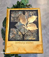
That topic was creating vintage tile greeting cards.  I'm an old soul and have always been drawn towards vintage items.  My favorite kind of creating is to take stamps, dies, and stencils and use them in a way that creates something that has a vintage flair.  I knew that I could take several techniques learned through the program and apply them to the topic - water coloring with inks and ink sprays, adding small details that will create a big effect, using various shapes to build a card, and bringing what inspires me into my creative process.  With this in mind, I created the cards that I would teach.  I started by making one that was a general vintage style and then making one in an Art Deco style.  These two cards had enough steps to take up a 2 hour time period.  Here are the cards:


I next wrote up my lesson plan to send to Erum for approval.  That lesson plan included the goal for the workshop, a list of products used, and the detailed steps to make each card.  I checked, and rechecked, each step to ensure that someone could pick up the document and make each card by just following these directions.  Once satisfied, I submitted it to Erum.  I was so relieved when I heard back from her that it was approved.

Once I chose the date for the workshop, I worked on creating an advertisement for it to post in the Altenew Facebook groups, on my Facebook page, and on my Instagram page.  Here is that advertisement:

I created it using Canva and was pretty happy with it since it was my first time using the program.  I then posted it onto Facebook and Instagram hoping to have some interest in it.  The goal was to have between 6 and 10 people sign up for the workshop and I was really happy to have 11 people sign up.  I ended up having three cancellations as it got closer to the workshop date - two prior and one the day of due to losing her internet connection.  That still left me with 8 crafting participants and my sister & niece also joined to watch me.

I also signed up for a Zoom subscription to allow me to host the workshop without interruption.  I cannot stress enough how worthwhile it is to do this since it isn't very expensive for one month and provides a much better experience for your participants.  I sent the zoom link to Erum and invited participants two days before the workshop to ensure that all received it.

In retrospect, all of this planning truly paid off.  The workshop itself went smoothly due to it.  I knew what order to teach the steps in and could refer to a printout as needed (and participants had it available as well), they knew what items to have available from the supply list, and there weren't any technology hiccups since the Zoom could go as long as I needed it to.

I'm including the supply list at the end of the post in an appendix to it.

The Workshop!

It was the day of the workshop before I knew it.  I'd be lying to say that I wasn't nervous about it at all; however, I wasn't as anxious as I thought I'd be at the time.  I knew that I was as prepared as I possibly could be and that made me feel better.  I logged in to setup and was happy to see a couple of early birds logged in.  Erum joined shortly thereafter, we made sure that everything was working properly and waited for the rest to join.

The first thing that amazed me was to hear how excited everyone was for the workshop.  "I've been looking forward to this", "this is so different!", and "I've never done anything like this before" are a few of the comments that I heard.  I started off by giving them some background on my interest in vintage and crafting, my inspiration for the tiles (old tin tile ceilings), and an overview of what we would accomplish.

Creating the tiles was such a fun experience.  I went over the embossing folder that I was using to create my tiles (Dreamy Tiles 3D Geometric Embossing Folder), how to make tiles using a different embossing folder, and some examples of various coloring techniques.  Here's a pic of the full tile set with various coloring mediums (ink sprays, pigment ink pads, acrylic paint, and gilding wax):
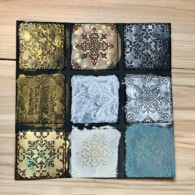
The attendees watched as I colored my tiles and started on their way to coloring their own.  They asked lots of great questions about coloring mediums and techniques.  We then went over adding either a turquoise/blue-green or rust patina to them.  One by one they started to share their tiles and I was absolutely blown away!  Their creativity was let loose, and they were all creating something different.  There were multicolored panels of tiles in different shapes, wooden tiles, and tiles colored different than mine.  At that moment, my heart got light, and I could not have felt more excited.  I was so happy to see them taking what I was explaining and adapting it into their own unique ways.  Creating the tiles takes up most of the time, which is why I started with that first.

We then moved on to discussing my cards designs and what I did to create the general vintage card.  Everyone was focused on their creation and yet we talked, shared, and laughed with each other along the way.  Once done with the first card, we moved on to the Art Deco style card.  I again spoke about my inspiration (The Great Gastby by F. Scott Fitzgerald) and off to work we went.  We ended up going over by about 15-20 minutes, but we did so with Erum's permission.

We ended with a quick wrap up of everyone sharing their cards.  If I was blown away by seeing their tiles, I was left almost speechless by their amazing cards.   They were absolutely gorgeous, and I couldn't have been more proud.  I'm not someone who "toots their own horn."  I seldom speak of successes and find receiving compliments to be somewhat awkward.  However, the words shared with me as we wrapped up the workshop brought me so much joy: "This was amazing", "you showed me that it's okay to go outside the box", "you gave me permission to be free with my crafting and not constrained by traditional techniques."  I was filled with so much joy as we said goodbye to each other.

Attendee Gallery:

Here are the amazing cards that were made in the workshop:


What did I learn?

I reflected on the workshop for a couple of days before I started to write some thoughts down.  I needed that time because I was honestly so elated by the experience.  Here are some of the lessons that I learned throughout the AECP program and from the workshop.

  • Take Risks: this is the most important lesson that I learned through it all - and especially from my workshop.  Don't do something easy or safe.  Do something that will stretch your limits and possibly even put you out of your comfort zone.  That's where the real reward and payoff exists.  I never really saw too many vintage style cards in online pics in Altenew groups.  I could have easily decided not to go with this topic because of that.  However, I don't believe that the experience would have been so special to me if I did.
  • Plan, Plan, Plan: I cannot stress enough how important this is.  I was given this advice by another Certified Educator and it was the best advice that I received.  Create a detailed lesson plan.  Create an example card made by following it.  Do prep work in advance of the workshop to give you the time to answer questions and not fall behind yourself during the workshop.  Subscribe to Zoom for one month to make the technology experience as flawless as possible.  Practice your camera views the night before your workshop.  All of this will assist you with being prepared and make it less stressful.
  • Use the Program to Find Your Style and Develop It: Vintage is not the only style of card or craft that I create.  I also enjoy clean and simple cards, florals, scenes, etc.  I like to tell stories in my cards.  Some people write stories and I like to tell them visually.  Those are all part of my style as well.  The techniques that you learn via the AECP program courses allow you to add those techniques to your tool bag and use them to enhance your style.  I created several vintage style cards for my courses.  I was so encouraged by Erum's feedback about it, embraced it, and ran with it.  All of that culminated in me deciding on my workshop topic and developing the lesson plan to support it.  I took the time to discover it and enhance it as I worked through the program, and I feel that it allowed me to hold a successful workshop.
  • There is Much for Us to Learn from Each Other: I cannot stress this enough - take the time to get to know those on the journey with you and those in your workshop.  There is so much to be learned from everyone.  That is what amazed me about my workshop - I learned so much from others and their creations.  I don't see the program as a competition but rather an opportunity to learn from so many other talented crafters.  We all have something to contribute and something to learn.  Make every effort to do so!
  • Simple is Better: Keep it simple because two hours fly by very quickly!  Everyone ooh's and ahh's over complicated designs.  However, they usually take longer to create.  The goal of the workshop is to offer a taster course on your topic - not a PHD level one!  I heard from others not to get too complicated, and I can't echo this enough.  You will be less likely to get tripped up by something, which should make the experience less stressful for you.
Wrap Up and Thank Yous

Overall, I felt that the workshop went very well.  Everyone seemed engaged and happy to be there.  I heard from a few attendees that they learned some new tools and tips to use in their creations.  I think the best feedback that I heard was that the workshop allowed them to feel free to "color outside the lines" and take chances they normally wouldn't take in their crafting.  That truly made me happy to hear.

The AECP experience was an amazing one for me.  I thoroughly enjoyed the classes, especially in level three when I was able to choose them.  (As a side note on that, I consider Creative Coloring with Erum and Runway Inspired Card Making to be the best two courses available.  Seriously - you should check them out!)  Erum was great in running the program and always provided helpful feedback on my project submissions.  She was also extremely helpful in preparing for the workshop.  I can't thank her enough.  I also want to thank Tamara Eastridge and Anet Van Zyl who were part of my AECP group.  They offered so much support along the journey.  I may have never met them if not for this program and I'm grateful to have made the journey with them.  I also want to thank Linda Fields.  She has been an inspiration and mentor to me through this.  I am better for knowing all of them.

Appendix - Supply List

These are the supplies that I used.  However, I offer suggestions on how they may create tiles from a non-floral embossing folder.  I will also offer suggestions for alternatives to what I used to help keep the cost of supplies low.

  • ·         Altenew Dreamy Tiles Geometric 3D Embossing Folder (any patterned, non-floral folder will work)
  • ·         Altenew Craft a Flower: Antique Rose (I only use the leaf from this; any die set with a set of leaves will work)
  • ·         Altenew Streamlined Sprig Die Set (Again, can make any die set with a set of leaves work)
  • ·         Altenew Deco Greetings (You may use whatever sentiment stamps you like though)
  • ·         Altenew Ink Spray: Caramel Toffee Metallic Shimmer, Antique Gold Metallic.  Optional ones include White, Black, Antique Silver, and Iridescent. (Note that ink cubes/pads may be substituted for the sprays; gilding wax may also be used in lieu of inks.)
  • ·         Altenew Crisp Dye Inks: Fall Harvest Set (Butternut, Pumpkin Pie, Yellow Ochre, Sicilian Amber), Turquoise (Tim Holtz Distress Inks will also work: Antique Linen, Tea Stain, Vintage Photo, and Broken China)
  • ·         Ocean Waves Altenew Artist Marker or any turquoise alcohol marker
  • ·         Gold pigment ink pad
  • ·         Glossy Accents (optional)
  • ·         1 A2 Kraft Card Base
  • ·         1 A2 Black Card Base
  • ·         1 4”x5.25” cream card panel (white may be substituted)
  • ·         1 4”x5.25” white card panel
  • ·         1 piece of black card stock cut to 5.5”x5.5”
  • ·         Altenew Brushed Copper Card Stock (any brushed metal card stock may be substituted)
  • ·         Jewels/sequins (optional)
  • ·         Clear Gesso (optional)
  • ·         Plastic knife or distressing tool (optional)

Thursday, August 22, 2024

Beauty of the Far East - Gecko Galz August 2024 Design Team Projects


Hi there, friends!

Thanks for stopping by Paper Play.  Today is my day to share my August design team projects for Gecko Galz.  Our theme this month was Beauty of the Far East.  Gecko Galz has so many beautiful products that may be used for this theme.  My goal was to use colors and styles inspired by the Far East to bring these projects to life.  Please be sure to let me know how I did!


My first project is my favorite for this month.  When I think of the Far East, I think of the beautiful design elements that we in the West have adopted from them.  In particular, I have always loved the Japanese paper screen doors and I wanted to create a frame that incorporates them.  I took a small rectangular wooden box from Michaels and used brown ink to stain it.  I then printed the photo to size, added some grunge to it with Distress Ink, and glued it to the inside of the frame.  Two strips of foam were colored with Distress Inks to look like stone and glued at the top and bottom of the frame.  Their purpose is to support the doors with pin hinges, and those pins stick into the foam to allow them to open and close.  I made the doors by cutting four rectangular pieces of cardboard to size, using an exacto knife to cut out the centers, and then coloring them with black and grey ink.  I printed the images for the doors to size on vellum and let them dry.  Once dry, I cut them to fit between two pieces of the cardboard and glued them into place.  Stick pins were glued to the top left and bottom left corners of one door and then repeated on the right corners for the other door.  I attached small nobs to the front center of each door to allow for easier opening, and then put the doors in place by inserting the pins into the foam and aligning into place.  This is actually a very easy project to create, and I think it adds a beautiful vintage style to any decor.


My second project is a vintage fan, which is really quite easy to create.  I took an 8.5"x11" inch piece of kraft cardstock and glued an 8.5"x11" piece of paper printed from the Asian Botanical Paper Pack to it.  I used Distress Ink and Ink Spray to add some grunge to the front and back of the paper.  I then used my scoring board to score a line at each 1" and then used a bone folder to burnish each line of the fold.  Once folded, I glued twine to the handle, starting at the bottom and working my way up to the point where I wanted it to end.  Some pearl gems were glued and the fan was complete.  I think it would look pretty either hanging or resting on a shelf.


My final three projects are greeting cards that I made.  The shadow box card and fun fold frame card were made using dies that I have for each.  I used a variety of Gecko Galz images, Distress Inks, alcohol markers, lace, and paper flowers to create them.

I hope that you enjoyed learning more about my August projects and that I may have inspired you to try one!

Thanks for spending some time with me here on Paper Play today.  Until next time . . . be well!

Tuesday, August 20, 2024

A Sweet Hello - TMS # 770


Hello, friends!
 
Welcome back to Paper Play!  It's another Tuesday and that means another Tuesday Morning Sketches challenge.  Today’s post is about my entry into challenge #770. 

Here’s my card and the sketch for the week:


 I created this using a 6"x6"card base.  I started with a 6"x6" piece of Kraft cardstock and used a deckle edge square die to cut out the center to create a frame.  I applied Vintage Photo, Broken China, Rusty Hinge Distress Inks around the frame and then misted it with Altenew Antique Gold Ink Spay.  As the frame dried, I took a piece of paper from a Unity Stamps paper pack, stamped the greeting and image onto it with Scorched Timber Distress Oxide Ink, and then dabbed some Antique Linen Distress Ink onto the panel to add some grunge.  A gold gel ink pen was used to color the leaves of the branch in the image to help set them apart and add additional gold tones to the design.  I adhered the frame to the card panel using craft glue, and then adhered the panel onto the card base.  I selected four paper flowers from Prima that I thought would work well with the color palette and glued them to the four corners.  Two gems were glued down on either side of the flowers and a gold marker was used to add the lines connecting them.
 
This was a really fun card to design.  I love the magic that happens on paper when you mix inks and sprays to add texture.


I hope that you enjoyed reading about my creative process.  Thanks for spending some time with me here today.  Until next time . . . be well!

Gecko Galz 15th Annual Blog Hop

  Hello Everyone! We want to welcome everyone to the Gecko Galz 15th Annual Blog Hop   This is our Tricks and Treats Blog Hop!  We have 14 A...