Showing posts with label masculine cards. Show all posts

Monday, October 9, 2023

AECP Level 2 Challenge

Hi there, friends!  Thanks for coming back for another Paper Play post.  This one is exciting for me as it's focused on my AECP Level 2 Challenge.  The post is a little longer since it covers the entire challenge - and I thank you in advance for reading through it!  Passing this challenge will allow me to move on to Level 3 of the program.  The challenge issued to me was:

  1. Select any 3 components from the classes in Level 1 or 2 and explain the 3 components that you’ve chosen for the project;
  2. Share design tips (if any);
  3. Make 4 masculine cards (themes include birthday, love/thinking of you, anniversary, and encouragement);
  4. Altered item/upcycled project;
  5. Create a detailed challenge blog post with a step-by-step photo tutorial and/or YouTube video.
And now . . . the challenge begins!

The components from AECP Levels 1/2 classes that I focused on are:
  1. Impressive Heat Embossing: I love to heat emboss!  I used elements as simple as adding a sentiment to more complex such as heat embossing an entire standalone panel and additional beautiful details.  A design tip to share on embossing is, when possible, use the same embossing powder on various elements to create a more cohesive look.  For example, on my first card, I used the same embossing powder for the sentiment and the entire forward city skyline.  I feel that it brings the card together.  However, it may not always be possible to do this.  On my second card, I wanted the heat embossed light detail from the lighthouse to sparkle, but thought it might make it hard to read the sentiment if I used the same powder for it.  So, I chose a different silver that doesn't have a glitter aspect to it.
  2. Let it Shine:  This was one of my favorite classes in the program.  It taught me to not be afraid to add some shimmer, sparkle, and shine!  I used this in various ways in each of my cards: through metallic heat embossing to add shimmer and sparkle, through heat embossing with a glossy powder to add shine, through using an iridescent ink spray to add shimmer & sparkle to the sky, through using sequins and gold glitter glue drops, and using acetate to create an interesting back ground with shine.  Don't be afraid to add some shine - both to your cards and in life!
  3. Easy Ink Blending Techniques/Creative Watercolor Media/Magical Marker Techniques: I grouped these three together because they all have a similar common purpose of using ink in various ways from creating backgrounds to adding beautiful details.  I used ink as a watercolor to create a sky, used ink to create vintage grunge details, and used markers on acetate to create a stained glass look.  Let us not forget to add using clear embossing ink to form the basis of light emitting from a lighthouse.  While not blending for color, it certainly is ink blending to add some shine to the card.
  4. Clean & Simple Boutique Cards:  While only required to use 3 components, I would be remiss if I didn't mention that I used this class as a guide on at least two of the cards that I made.  These two cards have minimal stamping and clean space to keep a very clean and simple overall aesthetic.
Here are the four cards and altered/upcycled item project that I created for the challenge:

 
I'll go over the creative process for each item and am also be sharing a link to optional videos on my YouTube channel that will show you the detailed steps that I took in creating them.  I chose to keep the videos separate to make it easier to view each.


Card 1: Congratulations

 
I love this card!  I had been toying with the design for a couple of classes and didn't proceed because I wanted to create more depth and didn't like previous attempts at it.  It then dawned on me - heat emboss a front panel, fussy cut it out, and adhere it to the card panel with double sided foam tape.  While it sounds easy, I just never previously though of doing it.  A city skyline is a really good element to use for a masculine card - it's very gender neutral and creates a nice scene.

Here's what I used to create it:
Here's how I made it:
  • Used the Indigo Skies ink and some spritzes of water to create the watercolor and painted the card panel.

  • Once dry, used a piece of scrap paper, covered the bottom third of the card panel, and then spritzed the panel with iridescent shimmer ink.  I knew that this would add the shimmer and sparkle to the sky, but the little blots of pink were not expected.  This was such a happy accident and adds so much more to the sky than I imagined.  Total win!

  • Once dry, used one end of the stencil and black ink to blend the back skyline; also traced the stencil outline with a black alcohol marker to add further definition and depth.

  • Used the other side of the stencil, a scrap piece of watercolor paper (note that any card stock is fine to use), and clear embossing ink to stamp image onto paper.
  • Sprinkled silver embossing powder over it and set it with a heat tool.
  • Fussy cut out the skyline.  Here's a design tip for you: if fussy cutting, take a similar color marker and go over the edges of the item to get rid of the white/colored edges and help it blend in.
  • Dusted the top of the skyline card panel with baking powder to act as an anti-static medium.
  • Stamped the congratulations sentiment with clear embossing ink, sprinkled it with silver embossing powder, and set it with a heat tool.
  • Adhered card panel to card base.
  • Applied double sided foam tape to the back of embossed skyline and placed it onto the card.
Here's a link to a video where you can see the card being created:
 
 
Card 2: Stay Strong


What is more strong than a lighthouse?  They stand out in a harbor, battling the elements and ocean, and provide a guiding light to those that need it.  They are so reassuring and strong.  That's why I chose to use one on my encouragement card - stay strong as things, as no matter what life throws at you and how much it may batter you, things will get better!  I intentionally designed this a clean and simple card emphasize the sentiment and message of the card.
 
Here's what I used to make it:
Here's how I made it:
  • Dusted the card panel with baking powder to act as an anti-static agent.
  • Stamped lighthouse and water with clear embossing ink.
  • Sprinkled image with white embossing powder and set with heat tool.

  • Stamped sentiment with clear embossing ink.
  • Sprinkled with silver embossing powder and set with heat tool.
  • Used the clear embossing ink pen to draw light coming from lighthouse.

  • Sprinkled the light outline with silver shimmer embossing powder and set with heat tool.
  • Filled in lighthouse glass panes with liquid chrome pen.  Here's a design tip for you: don't worry too much about stray glitter powder pieces with this card.  Any set stray glitter will look like stars in the sky!

  • Adhered card panel to card base with double sided tape.
Here's a link to a video where you can see the card being created:


Card 3 - No Matter How You Say It


I think that this is such a fun take on a birthday card!  I love the vintage grunge aesthetic and it's great to use on a map, which was my inspiration for the card.  My design for this card includes a world map with grunge and distressed edges centered on an older looking card base.  Included on the map is the sentiment Happy Birthday in several different languages - French, Spanish, Hawaiian, and Japanese.  The inside card panel also has grunge on it, wishes a Happy Birthday in English, and offers the greeting: no matter how you say it, I hope you enjoy your day.  We're all residents living together in this global village.  Why not share a greeting in other languages to help bring us together?

Here's what I used to make it:
Here's how I made it:
  • Added grunge to the edges of the card base using Almond Butter ink and ink blending tool.
  • Added light grunge to the card panels using Vanilla Cream ink and ink blending tool.
  • Distressed the edges of the first card panel using a plastic knife and used Hazelnut ink cube on edges of the panel.  Here's a design tip for you: you don't need a special tool to distress the edges of your paper!  Simply run the serrated edge of a plastic knife back and forth on the edge of the paper.  It will give you the same effect.  You may then run ink along it to add some grunge and aging.

  • Stamped the map with clear embossing ink, sprinkled it with brown embossing powder, and set it with a heat tool.


  • Stamped the four sentiments with clear embossing ink, sprinkled it with gold embossing powder, and set it with a heat tool.
  • Here's another design tip for you: if going for a vintage grunge look, don't worry so much about using an anti-static agent when using embossing powder.  Any stray pieces of powder that get set only add more grunge to the look of the card!
  • Took second card panel, stamped the inside greeting using Milk Chocolate ink, adhered double sided tape to the back of the panel, and adhered inside the card base.
  • Applied double sided foam tape to the back of the first card panel and adhered it to the card base.
  • Adhered a sequin to each corner of the card panel with craft glue, and then applied a drop of gold glitter glue into the center of each sequin.

Here's a link to a video where you can see the card being created: 


Card 4 - Kind and Thoughtful


A clean and simple card with a far from basic background!  I had been wanting to try this technique that my friend Annie Sharland shared in her Facebook group - a frosted acetate background.  The video is from Lou Collins and is shared on her Youtube channel.  I immediately had a vision of a frosted acetate brick wall with a stained glass window - and Altenew has my favorite 3D brick embossing folder.  This was a no brainer to make for my level 2  challenge!  I strongly encourage you to watch the video and see how easy it is to obtain this easy and effective look.

Here's what I used to make it:
Here's how I made it:
  • Sanded the acetate on each side with sand paper to get the frosty look.  Here's a design tip for you: it's important to use a very fine sandpaper for this, which will give you the frosted look.  A lower grade of sandpaper will not be as fine and the sand will scratch the acetate rather than give it a smooth, frosted look.

  • Put the acetate into embossing folder and run through die cutting machine.
  • Taped down the square die to acetate and run it through die cutting machine to create a window.
  • Stamped a tile onto vellum using clear embossing ink; use the acetate as a guide for placement so that stamp will show through the cut window.

  • Sprinkled the vellum with black embossing powder and set it with a heat tool.
  • Colored the tile with alcohol markers.
  • Cut a black frame from black card stock using the square dies, adhered double sided foam tape to the back of it, and placed onto acetate.
  • Adhered vellum to gray card panel with the 1/2" lip being glued to back of card stock.
  • Adhered acetate to card panel with 1/2" lip being glued to back of card stock (i.e. placed over vellum and then lip glued over it.)
  • Ran some glue around the sides of the vellum and pressed down the acetate to adhere them together.
  • Stamped You Are onto black card stock with white pigment ink, let it dry, and then cut out with coordinating die.
  • Stamped the Kind and Thoughtful sentiment onto a black card stock with white pigment ink, let it dry, and cut out the strip.
  • Adhered double sided foam tape to the back of each element and adhered onto the panel.

Here's a link to a video where you can see the card being created:


Altered/Upcycled Item - Vintage Floral Shadow Box


As previously mentioned, I am a huge fan of vintage design.  I think it has to do with me being an old soul and my nostalgic nature.  I had several ideas come to mind for this part of the challenge, but the one that won out was the one that allowed me to do a vintage design.  I decided to use an old Ivory cloth dinner napkin, add some grunge and stamping, and display it in a shadow box.  I learned a lot during the creation process - including to embrace mistakes/accidents and try to incorporate them into the design.  This happened to me while stamping the sentiment onto the napkin.  I wanted to stamp it a second time to make it darker, but the napkin had slightly moved and the resulting stamp was not aligned.  I had let out a big sigh and thought that I may have to do the whole project over again.  However, I remembered that the ink is water and alcohol reactive and rubbed a lot of it off with a rag.  It left a water stain - but I really liked the water stain!  I thought that it added character and further grunge to the design - and it looked great with the sentiment stamped over it.  Such a good lesson!

Here's what I used to make it:
Here's how I made it:
  • Wash, dry, and iron napkin.  Lay it flat and spray it with Antique Linen spray stain to add grunge.
  • Once napkin is dry, arrange it on stampwheel base, position floral stamp, and stamp it using Walnut Stain ink.  Stamp it again if darker image is desired.
  • Position leaf stamp in lower left hand corner and stamp it with Walnut Stain ink.  Stamp it again if darker image is desired.
  • Turn the stampwheel to align it in the upper left hand corner and stamp it with Walnut Stain ink.  Repeat this for the next two corners.
  • Position sentiment stamp and stamp it using Ground Espresso ink.
  • Cut the napkin to a 9"x9" square and adhered to the 8"x8" cardboard by flipping 1" border on each side to the back side of the cardboard and adhere down with glue or another adhesive.
  • Color the flower and leaves with colored pencils.  Here's a design tip for you: use colored pencils to color the flower and leaves rather than alcohol markers.  Alcohol markers may react with the ink used to stamp the images and cause the ink to bleed a bit.  Colored pencils will not do this!
  • Put the cardboard panel into the shadow box frame.
Here's a link to a video where you can see the card being created:
 
Phew . . . I know that was a lot to go over.  I thank you for sticking with me through it!  That wraps up my AECP Level 2 Challenge submission.  Wish me luck!
 
Until next time . . . be well!


Thursday, July 27, 2023

AECP Level 2 - Polychromatic

Hey there, crafty friends!

Thanks for coming back for another Paper Play post.  It’s been hot here in New England!  High temps and lots of humidity . . . good weather to stay in and craft to stay cool.  Doing so gave me time to focus on completing another course.  I just wrapped up AECP Level 2 course, Polychromatic.  As the definition of this word states, polychromatic is "of many colors", and the course focused on how to use multiple colors or multiple shades of colors in your card designs.  I'm not one who is afraid of color, so this class was right up my alley and I had a lot of fun making the card for it.

As I said, it's been hot here in New England, which makes it tough to think about winter holidays.  But I've been seeing so many "Christmas in July" card shares on Instagram and Facebook, and watching some Hallmark Channel Christmas movies, so it wasn't too tough to think about it.  The first thing that I thought of after the course lesson on white cards with pops of color was a Christmas card; lucky for me, I had the perfect Altenew stamps and dies to use.  What better way to show pops of color than with Christmas lights?  I also wanted to incorporate a non-traditional card design to jazz it up a bit.  I decided to go with a slide and lock card with left and right panels that open up and are held together with a sliding element.  Hmmm . . . Christmas lights on the card . . . why not go with a brightly colored ornament as the slider?!

I used the following items in making this card:

Here's how I made the card:

  • Cut a piece of 110lb white card stock to 10” x 7”.  I used 110 lb card stock for two reasons: 1). I wanted the card base to be very sturdy since I was making a slide & lock card; a lighter card stock may not have been sturdy enough; and 2). I wanted a heavier card stock since I’d be stamping the lights in bright colors and didn’t want to be able to see it on the inside panels of the card.  Here’s a TIP: if you only have a lighter card stock, for example 65 lb, and you can see the stamped colors on the inside panels, cut another piece of card stock to fit the inside of each panel and adhere it to your card.  This will cover up the ink, and will also add some strength to your panels.  Don’t be afraid to use patterned Christmas paper for those inside panels.  That would be a nice touch - make it your own!
  • Placed the paper into my scoring tool and scored the 10” side at 2.5” and 7.5”.  This created a 5x7 sized card with two folding front panels.
  • Used a bone folder to crease and flatten the two front panels.
  • Placed the folded card base onto my stamping platform and taped it down with some Post-It tape.
  • Positioned the Christmas light stamp onto card, inked it with green opal ink, and stamped the card.  Repeated one more time to ensure good ink coverage.
 
  • Chose a light bulb stamp and stamped each light socket with a different color.  I chose to follow a traditional red, orange, yellow, green, blue, and purple color palette, but you can use whatever  colors you’d like!

  • Once all of the lights were stamped, I took Ranger Glossy Accents and applied it over each light bulb.  This gave each light a glossy, glassy look.

  • While the glossy accents dried, I made the locking mechanism by:
    • Used the circle die from the Lovely Ornaments Die set and cut out two circles with my die cutting machine.
    • Colored one circle on both sides with the Tim Holtz Cocktail Party Mica Spray, and dried it with my heat tool.
    • Stamped the Happy Holidays sentiment from the Lovely Oranments stamp set in black ink and them traced over it with a gray glitter pen.
    • Used a paint brush to brush some glossy accents over the front of the ornament to make it pop.
    • Once dry, adhered three snowflakes to the ornament.
    • Cut the ornament hanger using the die and colored it with a silver gel pen; adhered it to the ornament.

    • Scored the uncolored ornament down the middle and attached it to the back of the colored ornament with a combination of micro glie dots and liquid craft glue.  Set it aside ro dry.  Tip:  use a second die cut or same sized piece of paper for the lock side.  It will ensure that the lock is large enough to close the two front panels.

  • Stamped sentiment inside of the card and traced over the first part with red and green glitter pens.
  • Once everything was dry, slid the ornament between the two front panels and the card was finished.


I really like this card.  Not only is it a great example of white with pops of color, it’s also fun & festive.  Merry Christmas in July!  Until next time . . . be well!

Thursday, May 18, 2023

AECP Level 1 Challenge

Hello, friends!

I've been quiet here on Paper Play for the past couple of weeks because I've been busy working on my AECP Level 1 Challenge.  The Level 1 Challenge was to:

  • Select any three components from the 10 courses in Level 1 to focus on and explain the components chosen. 
  • Create a gift set of his and her cards - one set for him and one set for her. Each set should have a minimum of 4 cards and a maximum of 6, and the set should have a cohesive look and feel.  The cards may be for various occasions.
  • Design and create gift packaging for each set.
  • Incorporate one recycled element into either a card(s) or packaging.

This was definitely a challenge . . . but I was up for it.  I have a lot to share in this post - and I thank you in advance for sticking with me and letting me tell you all about it!

The three Level 1 course components that I chose to focus on are:

  • Clean and Simple Boutique Cards: Several of the cards I created focused on a very clean and simple design and incorporated simple styling, stamped backgrounds, and incorporating metallic details by using specialty foil paper.  Three of my cards have a very simple style (for example, the Father's Day card.)  Sometimes, less is more and lots of frills aren't needed.  I like a classic look that focuses on the image.  I used a stamped diamond pattern with white pigment ink as the background for one of my feminine cards and I love the way that it turned out: simple, classic, and elegant.  I also incorporated a metallic pink foil paper into the card.
  • For the Guys: I obviously had this course in a mind since I had to focus on a masculine set of cards.  I used graphic elements, geometric elements, and a cohesive color palette, predominantly navy and white, to tie them together.  However, I also used the Pop Art component of the course and applied it to my design for one of the feminine cards.  I truly love the way it came out - very trendy and clean.
  • Easy Ink Blending Techniques: I used lots of inking techniques in my cards - gradient ink blends using a stamped diamond background, direct to paper inking in a couple of different ways, and faux water coloring several inks and water.  Each of them add their own special touch to the card in which they were used.  I used water coloring for my tulips and I achieved beautiful color results.  I used direct to paper inking in two different ways - one in swiping ink pads across paper to create the color for sentiments and by using spray mica inks to give a shimmery look to card components.

While only three components were technically required, it was hard not to go to the fabulous arsenal of techniques learned in the Level 1 courses and incorporate them into my designs.  I also incorporated elements of: All About Layering 3 & 4 to create beautifully stamped roses; Let it Shine because I love to add glitter, shimmer, and shine to make my cards sparkle; Easy Die Cutting Techniques - many uses of this, but especially inlaid die cutting; and Irresistible Inking Techniques such as running ink around paper edges to make them pop just a little bit more.

Now that I've reviewed the course components used, let's dive into the details of the card sets & packaging and see some pictures along the way!

Masculine Card Set


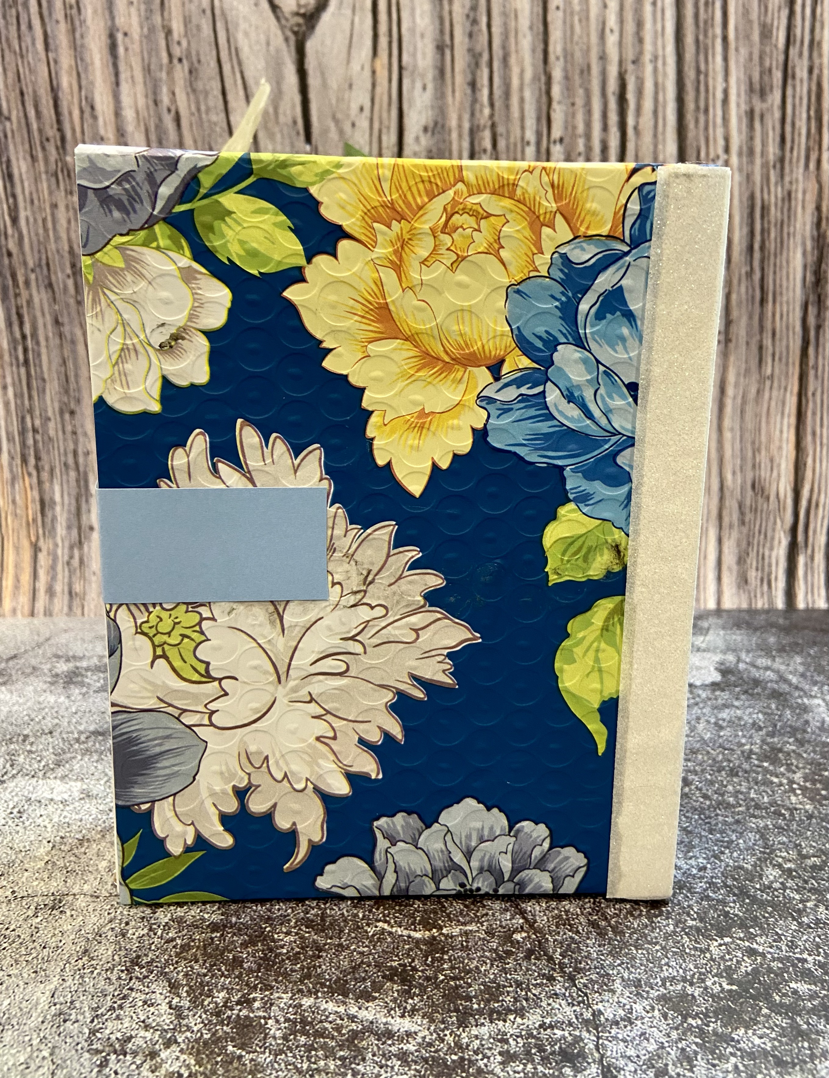
I created a set of four masculine cards and a book box for the gift packaging.  I'll go into more detail about how I made the book box later on in the post.  I did incorporate my recycled element into the gift packaging, and that item was the beautiful printed tyvek part of an Altenew shipping envelope.  I cut the envelope open, carefully removed the bubble wrap from the back of it, and then cut the tyvek print to size.  This shipping envelope is too pretty to throw out and needs to be highlighted!
 
So, what gives this set a cohesive look and feel?  I focused on the color palette used in my gift packaging, which included blues, greens, white, and gray/silver, and used those colors throughout my card set.  I started with just navy and white for the first card and then gradually added additional colors with each successive one.  All of the cards also have either a white or navy base.  This ties each of them together - even though the images and some design elements differ between cards, they have a similar look.

Card 1 - Happy Father's Day


Is there a more appropriate occasion for a masculine card than Father's Day?  It seemed like a natural choice to me.  The design that I had in mind for it was very clean, simple, and classic.
 
I used the following items to create it:
  • the sailboat stamp from the Altenew Seas the Day Stamp Set 
  • Altenew Indigo Skies Fresh Dye Ink
  • sentiment stamps from the Lawn Fawn Happy Happy Happy Stamp set
  • frame die from The Stamps of Life
  • Honey Bee Stamps Adhesive Gems
  • white card stock and navy blue card stock.

The sailboat was stamped in Indigo Skies ink onto a piece of 2.5" x 3.5" white card stock, and the sentiment stamps were aligned and stamped using the same ink.  I chose this size so that I could center it into the frame cut from white card stock, which I then aligned on my navy blue A2 sized card.  Altenew double sided foam tape was used to adhere the sailboat panel and frame to the card base, which gives it added dimension.  I thought that dimension was an important design element since the card is monochromatic, clean, and simple.


Card 2 - thanks


Hummingbirds are so unique due to their elusive nature, and that brings a sense of joy & optimism when you see them out in nature.  What better way to say thanks than by sharing the joy & optimism that someone has brought to you?  I again wanted a very clean & simple design for the card so as to showcase the hummingbird.
 
Items used to create this card included:

I started by cutting the frame die out on navy card stock.  I didn't want to use all four panes of the frame and decided to snip out the vertical line going down the center of the frame so that I'd have two horizontal planes that were big enough to support the hummingbird.


The frame was centered onto a 3.5" x 4.75" white card stock panel using double sided foam tape.  I then used the Water Hyacinth ink to add a little ink blending to the top half and used the Fresh Leaf ink to do the same to the bottom half.  The hummingbird was stamped twice onto a scrap of white card stock using the Indigo Skies and Shadow Creek inks and then fussy cut.  Double sided foam tape was added to the back of each bird and adhered to the center of each frame section.  I then directly applied some Water Hyacinth and Fresh Lead inks to a scrap of white card stock using the ink cube, and cut the word thanks and its shadow from the card stock.  The white card panel was centered and adhered to an A2 sized card base using double sided tape, the word and shadow were glued together with craft glue, and the word thanks was adhered to the center of the frame using craft glue.  I chose to add some bling using clear sequins so that they would pick up the blue and green ink blends.


Card 3 - you got this


Sometimes you want to give a note of encouragement to a special guy in your life.  This type of card can often seem too sentimental or sappy - when you just want to simply say "you got this."  A butterfly is a great way to symbolize encouragement for a guy - they go through so many stages of life and end up showcasing all that they are in the end.
 
I used the following to create this design:
 
I started by stamping the Mosaic Diamonds background stamp onto a a 3.5" x 4.75" piece of white card stock.  I didn't want a solid, one shade background and decided to use three shades of blue to give a more gradient look - Ultramarine, Eastern Sky, and Iceberg.
 
Here's a TIP for getting a gradient pattern when using a stamp: start by adding the lightest shade to the stamp first, decide where you want the gradient to start and then apply your next shade to that part of the stamp, and the last ink to be applied should be your darkest.  Not only do you achieve your gradient shading, you also build up each darker shade to get a much richer blend.

My design incorporated a larger diamond towards the right side of the card, and the diamond from the Geo Frames Stamp& Die set was the perfect size for it.  I stamped the diamond onto a scrap of white card stock and then cut it out with the coordinating die.  I cut out an extra diamond to act as a back of the diamond.  I adhered the inked diamond on top of the plain white diamond using double sided foam tape for extra dimension, put double sided tape on the back of the diamond, and placed it onto the gradient blue panel.  That panel was then centered and adhered to an A2 sized navy blue card base. Next steps included: stamped my butterfly, colored it with the liquid chrome marker, cut it out with the coordinating die, stamped my leaves and cut them out with the coordinating dies.  The leaves and butterfly were attached the diamond using craft glue.  The final step was to create the sentiment.  I used the Tanzanite ink cube and applied it directly to a scrap piece of white card stock, stamped the sentiment with silver pigment ink, and cut it out.  I like how the ends of the sentiment strip have some white on them - it's kind of a more artsy look.


Card 4 - happy birthday


I decided on a birthday card for my final card in the set.  I had recently purchased the Dreamy Tiles 3D Embossing folder and knew that I wanted it in my design.  The tiles have an antique feel to them and I thought it would be a nice background for the card.  However, I also knew that I didn't want to leave them plain . . . they needed some color to show off their beauty and dimension.
 
The following items were used in making the card:

The tile background was so much fun to create!  I used an A2 sized piece of navy card stock aligned it with the bottom two rows of the embossing folder, and ran it through my die cutting machine.  TIP: lightly mist the back of your card stock with water before using it with an embossing folder to prevent the paper from tearing or cracking.   With the card panel embossed, it was time to color it.  Mica sprays were the perfect medium to apply to add layers of color and shine.  I laid the panel onto a piece of cardboard, used Post It Tape to adhere it down and also tape off the sections in between the tiles, and started spraying.  TIP: Use the same piece of cardboard for spaying whenever you use mica sprays.  Excess Spray will build up on it over time and you can spray it with water to color other pieces of card stock at a later time.  It's a great way to get more use out of the excess ink!  I sprayed the Pewter first to give the base a darker gray look, added sprays of Winter Frost next to add some blue hues, and then added random drops of Shiny Bauble to give an occasional lighter splash of color. The panel was dried using my heat tool.  The Post It Tape was then removed and I was really happy with the resulting card background.  One more TIP: save the Post It Tape that was splashed by the mica spray.  You can use it in your design or another card!  The card panel was then adhered toan A2 sized white card base with double sided tape.


I next cut a white frame for the card using the Taylored Expressions Frame in Frame 3 die and some white card stock, and then adhered it to the card base.  I stamped, colored, and cut a flower and leaf using the Adore You Add-On stamp and die, and adhered them to the card using double sided foam tape.  The final step was to create my sentiment.  I cut the shadow from the words happy birthday from the saved mica sprayed Post It Tape.  Such a great way to incorporate another pop of color into your design!  I also cut the shadow from white card stock, and used craft glue to adhere the post it tape to the card stock.  the actual words happy birthday were cut from navy blue card stock, glued to the shadow pieces, and adhered to the card using double sided foam tape.


That wraps up my overview of the masculine card set.  I'll cover the creation of the box after telling your more about my feminine card set.

Feminine Card Set


Similar to the masculine card set, I made four cards for the feminine card set and a book box for gift packaging.  I incorporated a second recycled element into the challenge by using the printed tyvek piece of another beautiful Altenew shipping envelope to adorn the packaging.  This one had lots of pink, purple, and green and was a perfect choice to use as part of the feminine set.  Also similar to the masculine set, I chose to tie the cards together bu using two main colors of card stock, white and pink in this case, and incorporating the colors from the packaging.  I think you'll agree that this gives the cohesive look and feel.

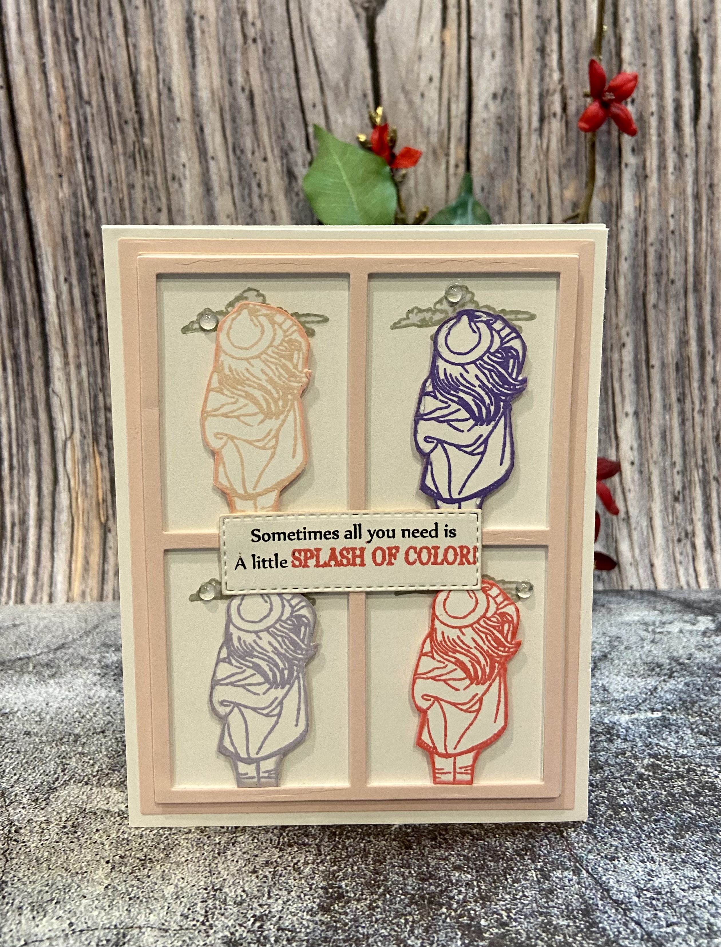
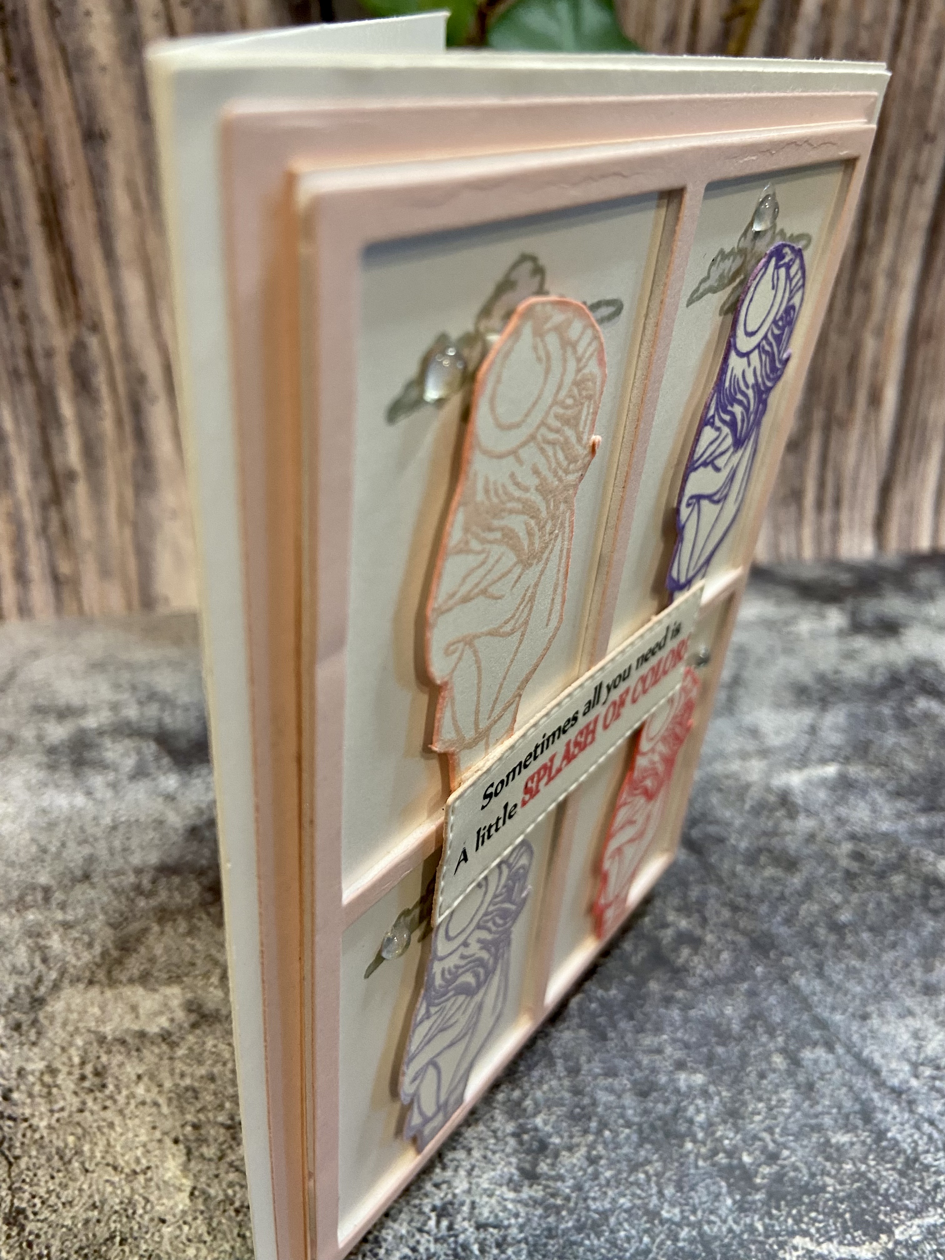
Card 1 - Splash of Color


I think that this may just be my favorite card of the set!  Intended to be an encouragement or thinking of you card, the images and colors used perfectly convey visually the sentiment - Sometimes all you need is A little SPLASH OF COLOR!  The design is based on the concept from the Pop Art lesson in the For the Guys course.  But why limit it to just masculine cards?!  
 
The following items were used to make it:
 
I used the window frame die to cut a frame out of pink card stock and adhered it to a 3.5" x 4.75" sized piece of white card stock using double sided foam tape.  I then adhered that piece to an A2 sized white card base.  I stamped the cloud stamp at the top of each window section using Silver Lake ink, and then colored it with the cool light gray alcohol marker.  The image of the woman was stamped onto a piece of white card stock four times (using Blush, Coral Berry, Wisteria, and Hydrangea inks), and then fussy cut with detail scissors.  Double sided foam tape was applied to each stamped image and then each image was placed into a window frame.  I used a small stitched rectangle die to cut a strip for the sentiment and stamped the sentiment onto it using Jet Black and Coral Berry inks.  TIP: when stamping a sentiment with two different colors, cover the part of the sentiment to use the second color with Post It Tape, ink the first part of the stamp, remove the Post It Tape, and then stamp it.  Clean your stamp, cover the first part with Post It Tape, ink the second part of the stamp, remove the Post It Tape, and then stamp it.  You'll get a perfect stamp of the sentiment using two colors! I adhered the sentiment strip to the center of the frame with craft glue.  The result is a colorful, clean card that is sophisticated and the perfect way to remind someone you care for to look for those little splashes of color in life.


Card 2 - Shine LIKE A DIAMOND


I love the diamond background of the Shine Like a Diamond background stamp.  It's very classy, very elegant, and looks amazing on pink card stock stamped with white pigment ink.  This card may be used to let a special women or girl know that she's done an amazing job and to remember to always brightly shine.
 
The following items were used to make it:

The first step was to create the background.  I stamped the Shine Like a Diamond background stamp onto an A2 sized piece of pink card stock using white pigment ink.  I dried it with my heat tool so that the pigment ink wouldn't get smeared, applied double sided tape to the back of it, and adhered it to an A2 white card base.  I took the largest diamond die from the set and cut out a diamond shaped piece of pink foil card stock.  I then took the next size diamond die from the set and cut out one from white card stock.  The word shine was cut from the center of the white diamond, and it was also cut from a piece of pink foil paper.  I adhered the white diamond to the pink diamond using craft glue, and then inlaid the pink foil word shine into the white diamond with craft glue.  Double sided foam tape was adhered to the completed diamond and it was centered onto the card base.  I then stamped the sentiment LIKE A Diamond under the word shine with jet black ink, and traced over it with a black glitter gel pen.  Green and pink adhesive gems were applied to the card and that wrapped it up!


Card 3 - happy birthday


Of course there has to be a floral card in a feminine set!  I happened to include two.  The first one showcases the Shrub Rose layering stamp set.  These roses are gorgeous!  I paired them with a geometric embossed background and, while perhaps as the creator I'm a bit biased, the resulting birthday card is stunning.  I used these items to create it: Altenew Shrub Rose Layering Stamp and Die Set, Altenew Geo Diamonds 3D Embossing Folder, Spellbinders Thanks Enclosed Sentiment Dies, Altenew Crisp Dye Inks: Blush, Pink Pearl, Bamboo, Fresh Leaf, Shadow Creek, Hunter Green, and Jet Black, Concord & 9th Premium Dye Inks: Nectar, Grapefruit, and Honeysuckle, Sakura Black Glaze Pen, and Spectrum Noir Sparkle Clear Overlay Micro-pigment Pen.
 
I started by making the card base.  A 3.5" x 4.75" sized piece of white card stock was misted with water and placed onto the embossing folder.  I took the Pink Pearl ink cube and ran it over the opposite side of the embossing folder before running it through my die cutting machine.  The result is this beautiful, pink embossed geometric design that I adhered to an A2 sized pink card base using double sided tape.  Next up was to create the roses.  The Shrub Rose Layering Stamps make it easy to create roses by aligning each stamp and stamping using different colors.  One rose was created using Jet Black, Blush, Nectar, Grapefruit, and Honeysuckle inks.  I substituted Pink Pearl for Blush in the second one.  The leaves were made by using the layering stamps and Fresh Leaf, Shadow Creek, and Hunter inks.  The roses and leaves were then cut with the coordinating dies.  Leaves were attached to the card using double sided tape, and the roses attached using double sided foam tape.  I ran the Fresh Leaf and Shadow Creek ink cubes across white card stock and then used the word dies and shadow dies to cut each from it.  The word was glued to the shadow with craft glue and then glued to the card.  Some sparkle was added to the roses and leaves using the micro-pigment pen, and three drip drops were attached with craft glue.


Card 4 - hello friend


My final card in the set is made of all die cut pieces - no stamps at all.  My vision for the design was painted tulips against a geometric background.
 
The card was made using

I started the card with the background.  I cut the Curtains Leaf cover from an A2 sized piece of chipboard and placed it onto my mica spray piece of cardboard.  I proceeded to spray it with Hunter Chroma Mist, Fresh Balsam Mica Spray, and Merry Mint Mica Spray and then used my heat tool to dry it.  The result is a beautiful green background that sparkles.  I ran craft glue along the back background and adhered it to an A2 sized piece of vellum.  I like that the vellum is a little more dull than traditional white card stock so that it doesn't detract from the green background.  TIP: I used chipboard to cut the background since it's thicker than card stock and will provide some depth to the card.


Next up was using the dies to cut out the pieces of the tulips from white card stock.  I did a faux water color technique to the card stock using the Blush, Pink Diamond, Cotton Candy, Coral Berry, Fresh Leaf, and Shadow Creek inks and water.  I applied the inks into my glass craft surface, misted them with water, and used a paint brush to apply layers of color to the pieces.  I outlined the flower petals with the Coral Berry marker and added some highlights using the white gel pen and Frosty Pink marker.  I outlined the leaves and stems with the Moss marker, and added highlights using the white gel pen, Parrot, and Moss markers.  This combinations of inks and markers gave a very painted look to flowers, stems, and leaves.  I assembled the flowers and glued them to the card base with craft glue, added some sparkle with the micro-pigment pen, and glued down three Drip drops.  The sentiment words and shadows were cut from white and pink card stock, glued together, and glued down to the card.


Another set of cards completed!  Time to discuss the gift packaging . . . 

Gift Packaging


I already let you know that the recycled item(s) used was the tyvek part of two different Altenew Shipping envelopes.


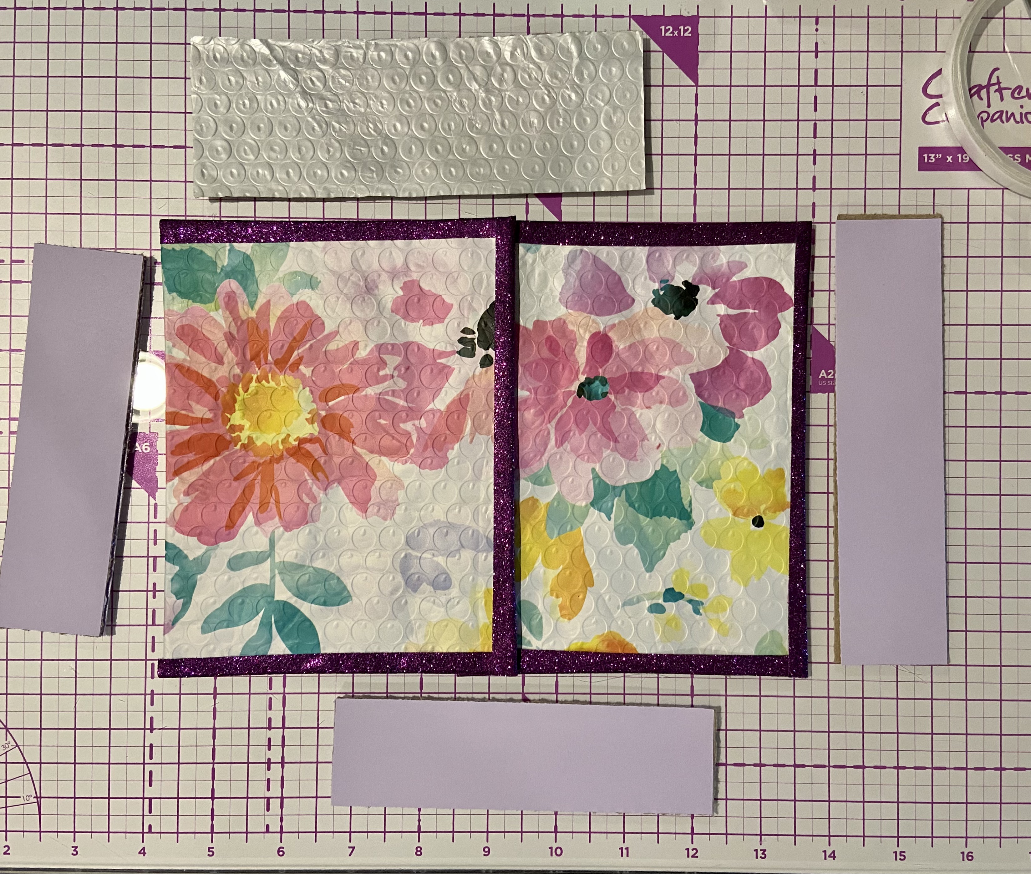
These prints are so beautiful and are just perfect to use in place of paper to cover my book boxes.

The structure of each book box is the same.  I cut the following sized pieces of chipboard for each book box:


I then covered those pieces with similar sized pieces of the respective packaging or matching card stock:


I scored the binding piece at every 1/4” to make it flexible; scored the two short sides at 1/2” at the top and 1/2 inch at the side that will connect to form the base.  Cut out the small scored square of each end and cut an angle in the opposite corner to help it form and adhere to the next piece better.


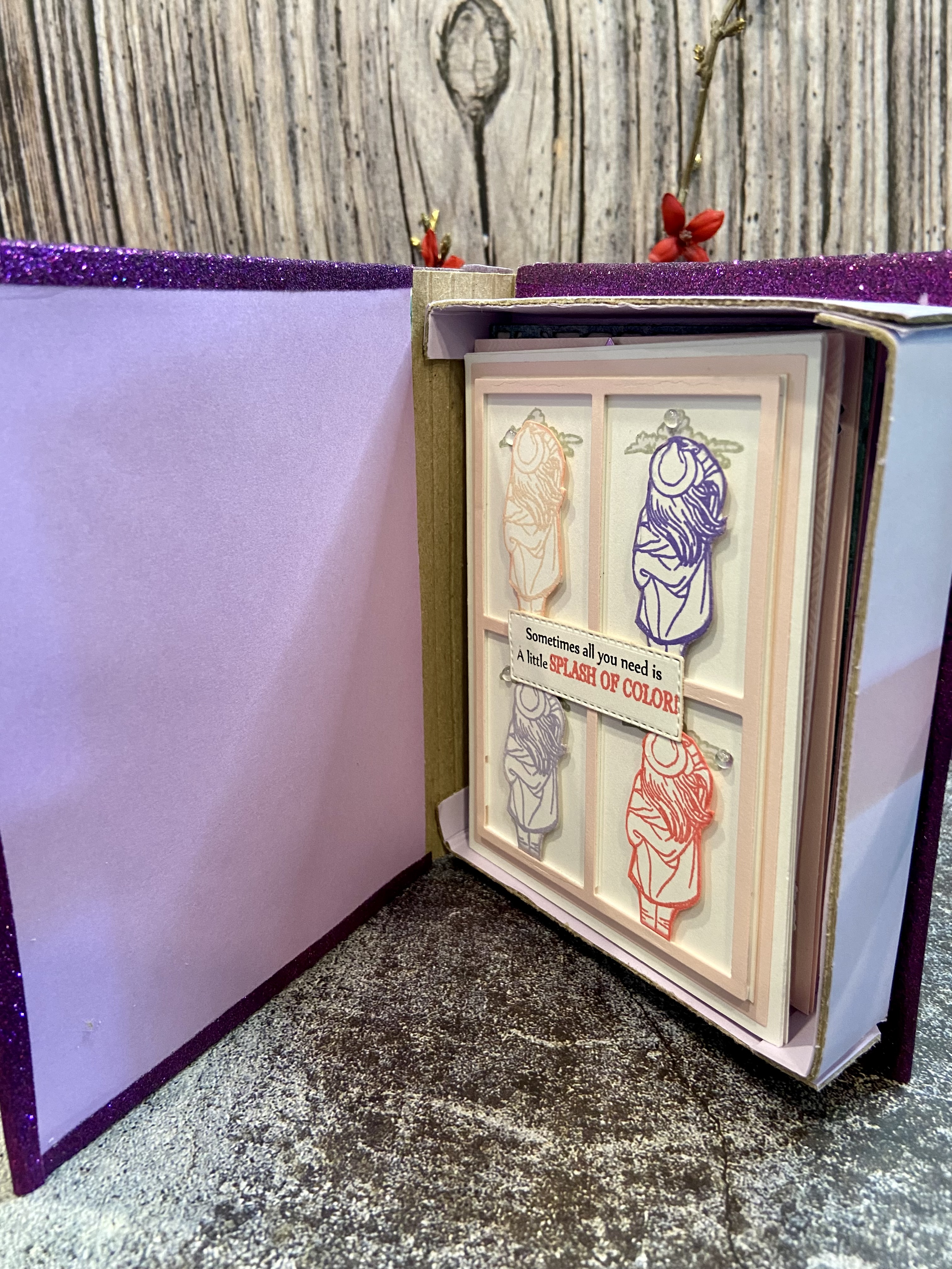
Next up was assembling the pieces using double sided tape and craft glue: formed the foundation of the box by connecting the two smaller sides to the longer side; adhered that base onto the bottom foundation piece with double sided tape and craft glue; adhered the binding to the bottom cover with double sided tape and craft glue, and then the binding to the top cover with double sided tape and craft glue.  I used glitter washi tape to cover the binding and the connection to to the top & bottom covers and adhered it with double sided adhesive tape.


As you can see, the book box perfectly holds the 4 A2 sized cards and envelopes.  Using the Altenew shipping packaging keeps it from ending up in a landfill (AGAIN, it is too pretty to throw out - save it!) and coordinated so well with the color palette that I chose for each set of cards.

I hope that you found this Paper Play post to be both informative and inspiring.  I know it was a longer post than usual and appreciate you sticking with me!  Please feel free to reach out to me with any questions you may have about the cards or packaging, or to share any thoughts on the post.  Until next time . . . be well!


Gecko Galz 15th Annual Blog Hop

  Hello Everyone! We want to welcome everyone to the Gecko Galz 15th Annual Blog Hop   This is our Tricks and Treats Blog Hop!  We have 14 A...