Tuesday, April 25, 2023

AECP Level 1 - Irresistible Inking Techniques

Thanks for coming back to Paper Play, friends!

Today's post has special meaning for me since it's about my 10th, and final, course for AECP Level 1.  I was a little nervous when I entered the program back in early March and thought that 10 courses was a little daunting.  I wondered how long would it take me to complete all 10?  I quickly realized that the courses were full of inspiration and encouragement, and I started to quickly go through them.  It became a bit of a balancing act for me since I, like many of you, also have a day job that funds my creative journey.  But I found that the program was my proverbial "carrot dangling on a stick" - staying focused on getting through spreadsheets and analysis in order to wrap up the work day and create.  And now, about a month and a half later, here I am writing my blog post for a course that I truly enjoyed and that encouraged lots of creativity, Irresistible Inking Techniques.

The course was a perfect bookend to Level 1 for me since my first class focused on layered stamping and this one on ways to use inks other than traditional stamping.  I made two cards for it, which I present to you below.
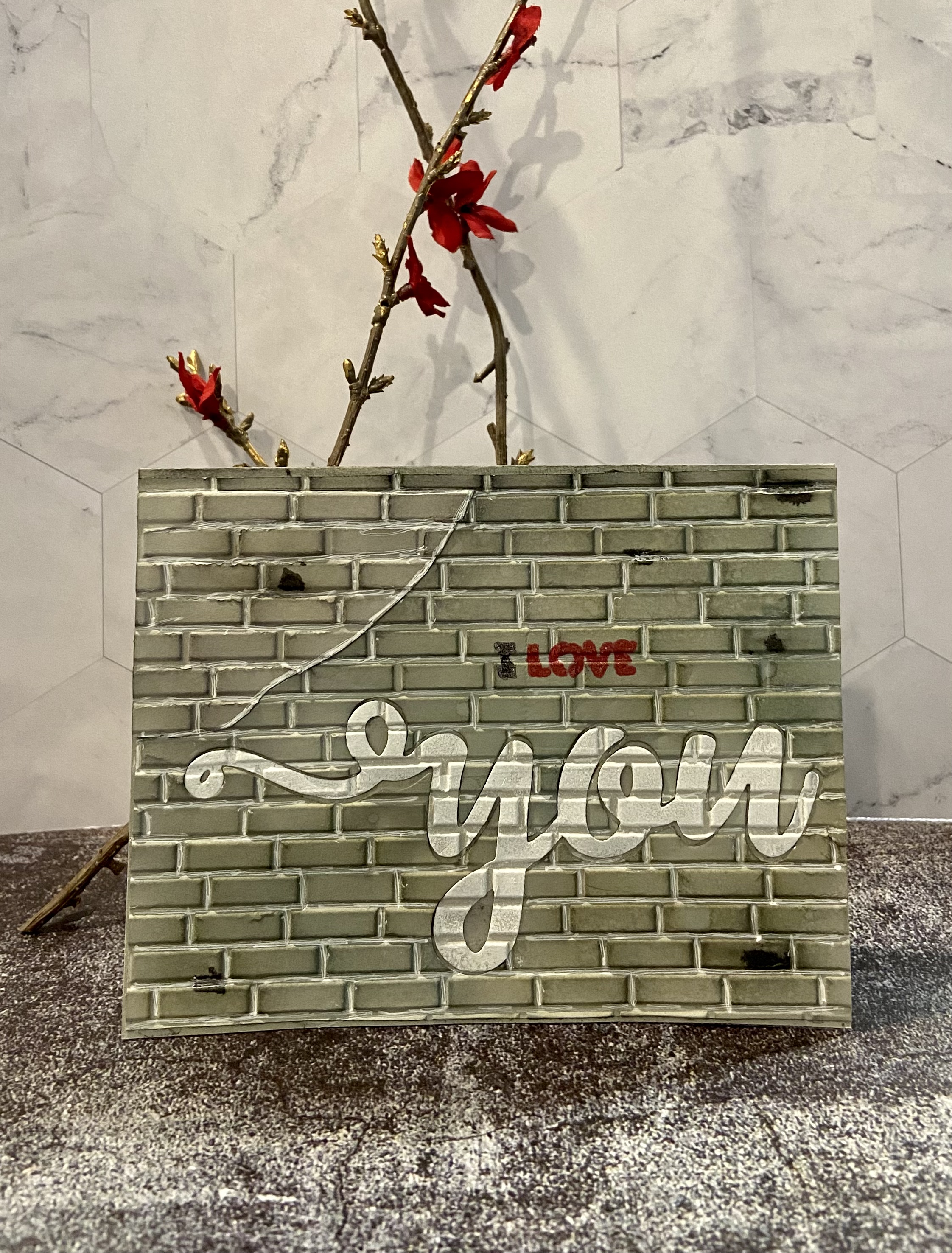

Card 1


My first card was loosely inspired by a lyric in the Carly Simon song, "Do the Walls Come Down."  It's a beautiful ballad about someone wondering if her former lover let's down their guards and thinks of the moments that they shared together.  The lyric is, "something in my pocket, that was written years ago, in faded ink said you are my fire, do you think so?"  It has always made me think of an old book or journal, full of tattered pages of light ink that fades more and more each year, and has a secret message hidden in the pages.  I used that as image as the inspiration for this card.

The items used in creating this card included: Altenew Painted Flowers Add-On Stamp & Die Set, the sentiment from the Altenew Magnolia Heart Stamp Set, the Stampendous Cling Vintage Note Stamp for the background, the following Altenew Crisp Dye Inks - Wisteria, Hydrangea, Shadow Creek, and Evergreen, the following Tim Holtz Distress Inks - Antique Linen, Vintage Photo, and Ground Espresso, a piece of twine, some washi tape that I had on one for the card base border, a water mister, a braying tool, double sided foam tape, and craft glue.  I love that Altenew offers these mini-stamp sets that give you one small item for when you need just that one.

The design that I had in mind was a journal with multiple pages.  You come across a hidden message in the middle of that journal, and that message is behind the torn section of a couple of pages.  I made the card by:
  • Stamped some Vintage Photo distress ink on my glass work surface and misted it with water.  Ran my braying tool through it to pick up the ink and rolled it over a few pieces of vintage deckled edge paper that was the perfect size to look like an open journal.  I repeated this a couple of times to give the paper an older look.
  • Once the paper was dried, used an ink brush and Antique Linen distress ink to add a further vintage look to the paper.
  • Used the background stamp and the Ground Espresso distress ink to stamp the writing on each of the two pages of the first sheet.
  • Put the second piece of paper behind the stamped piece and ran one side through my die cutting machine with a torn paper die.  It's important to note that I didn't run it completely through as I didn't want this piece to be fully cut out - just partly cut.
  • Added the third piece of paper behind the second, scored all three pieces in the middle on my scoring tool, ran some glue along the score lines on the second and third piece, lined up all three pieces of paper, and pressed them together.  I know had the pages of the journal arranged.
  • Took the Vintage Photo distress ink and used the technique of running it around the edges of the journal to give a more aged look and help each page stand out from the others.
  • Rolled up the partially cut two pieces of paper, placed some craft glue along the bottom of the roll, and adhered it to the page.  This reveals the space where the message is hidden in the journal.
  • Stamped the small flower outline using Ground Espresso ink onto the hidden message area; layer stamped the other parts of the flower using their stamps and Wisteria, Hydrangea, Shadow Creek, and Evergreen inks.
  • Stamped the sentiment using Ground Espresso distress ink.
  • Ran the piece of twine down the center of the paper and used craft glue to adhere it to the back of the journal pages.
  • Placed doubled sided foam tape on the back of the journal; placed an extra piece on the left and right sides of the journal to help make it look like its lying open.
  • Adhered the journal to a 5x7 cream card stock base.
  • Ran the washi tape along the border to give a little extra color and printed image to the card.


I really like the resulting look of the card.  It would make a beautiful anniversary card, birthday card, or thinking of you card.   Does it make you think of the song lyric above?


Card 2


My second card's inspiration was definitely very differwnt than the first card: purple flowers just swaying in the breeze.  I had recently purchased the Altenew Whimsical Flowers Stamp Set and just imagined them gently swaying, side to side, in a gentle breeze.  In addition to that stamp set, I used the following items: Altenew You Are Everything Stamp & Die Set, the following Altenew Crisp Dye Inks: Ultraviolet, Hydrangea, Shadow Creek, Sunkissed, and Jet Black, Delicata Gold Shimmer Pigment Ink, Arteza Inkonic Green Fine Tip Pen, Sakura Gelly Roll White Gel Pen, and a water mister.

I created the card by:
  • Stamped the three flower outlines onto a 4x6 piece of white card stock using the Ultraviolet ink.
  • Stamped some Wisteria and Hydrangea ink onto my glass work surface, misted it with water, and used the technique of water coloring with ink to color the flowers with a paint brush.
  • Stamped some Sunkissed ink onto the glass work surface, misted it with water, and colored the flower centers with a paint brush.
  • Stamped some Shawdow Creek ink onto the glass work surface, misted it with water, and painted flower stems and leaves.  I then used the green fine tip pen to outline the stems and leaves.
  • Used the white gel pen to add some additional detail to flower petals.
  • Ran the Ultraviolet ink around the edges of the white paper and used double sided tape to adhere it to a light purple 5x6.5 sized piece of card stock.
  • Stamped the words You Are using the gold shimmer ink and used the corresponding die to cut them out.  Then cut out an additional 4 more sets of the words.  Glued all five sets together, making sure that the gold set was on top, and glued the words onto the white card panel.
  • Cut a small piece of the light purple card stock and stamped the expression The Sweetest Person I Know using jet black ink.  Adhered that piece onto the white panel, underneath the words You Are, using double sided foam tape.
  • Stamped some more Wisteria ink onto glass surface, misted it with water, and used a paint brush to add some ink splatters to the top portion of the white panel.  I Then used the paint brush and ink to add some brush marks to various places on the white card panel.
  • Ran the Ultraviolet ink around the edges of the purple card stock, and used double sided tape to adhere it to a 5x7 white card base.
  • Added three small purple gems to the card front.


The second card is finished!  It's light, whimsical, and perfect way to tell someone how you feel about them.


That wraps up this post on Irresistible Inking Techniques.  Until next time  . . . be well!  

Saturday, April 22, 2023

AECP Level 1 - Easy Die Cutting Techniques

Happy weekend, friends!

Today’s Paper Play post is on the topic of die cutting.  I just finished my 9th AECP Level 1 course, Easy Die Cutting Techniques, which went over several different ways that you may use your dies aside from traditional die cutting.  Like many of you, die cutting was my introduction to card making and paper craft.  I was so excited when I bought my first Sizzix Big Shot, and worried that I did something wrong when I ran through my first dies and heard the plates crackle!  I’ve since grown to love that sound, and have gained many skills since making my first card.  I now have even more techniques to employ thanks to this course.

I focused on three techniques in the two cards below - traditional die cutting, using dies as stencils, and inlaid die cutting.

Card 1


My first card was inspired by graffiti art.  The idea came to me as I was watching the lesson on inlaid die cutting.  I thought it would be fun to create a card that looked like a wall and used an inlaid piece to be the focal point of the graffiti.  The following items were used in making it: Altenew Brick Wall Geometric 3D Embossing FolderAltenew You Matter Die Set, gray card stock, Concord & 9th Dove Premium Dye Ink, the following Tim Holtz Distress Inks: Weathered Wood, Hickory Smoke, and Antique Linen, Lawn Fawn Yeti White Pigment Ink, Altenew Jet Black Ink Spray, Sakura Gelly Roll White Gel Pen, black and red glitter gel pens, double sided tape, craft glue, and a water mister.

The card is super easy to make:
  • Die cut the word “you” from an A2 sized piece of gray card stock
  • Aligned the card stock in the embossing folder and put the die cut “you” back into place 
  • Misted the card stock with water (to prevent the paper from cracking), closed the embossing folder, and ran it through my die cutting machine
  • Put a torn scrap piece of gray card stock into the embossing folder and ran it through my die cutting machine
  • Inked the embossed word “you” with the white pigment ink and used my heat tool to help set and dry the ink
  • Adhered the wall to an A2 sized gray card base with double sided tape
  • Applied layers of gray, Weathered Wood, Hickory Smoke, and Antique Linen inks to the rest of the wall to give it a grungy look
  • Put some craft glue on the embossed scrap piece and adhered it to the upper left corner of the wall in order to make it look like that part of the wall had been replaced or worked on
  • Applied inks to the new section of wall
  • Lightly misted the wall with water and let it dry to give it a more textured look
  • Ran the white gel pen through the grooved lines and edge of the reworked wall section to give the appearance of mortar
  • Used the jet black spray ink to add a few drops of black in random places
  • Put some craft glue on the back of the embossed “you” and laid it in place on the wall
  • Created a stencil by running the “I Love” die through my die cutting machine with a small piece of white card stock, used some Post It Tape to hold it in place, and stenciled it onto the wall using black and red alcohol markers
  • Traced over the words with black and red glitter gel pens

The graffiti wall card is done!   You can see a closeup of the reworked section of the wall in the first pic below, and a closeup of the graffiti in the second.  I think that the reworked section adds additional character to the card.  I hope you agree!


Card 2


The inspiration for my second card was simple - spring flowers blooming on a branch.  It focused  on traditional die cutting to make the flowers & frame, and using a die as a stencil to create the branches.  The following items were used to create it: Altenew Itty Bitty Flowers Die SetAltenew Well Read Stamp Set, Taylored Expressions Frame in Frame 3 Cutting Plate, vellum paper, three shades of blue card stock, cream card stock, Tim Holtz Walnut Stain and Salvaged Patina Distress Inks, Tim Holtz Antiqued Bronze Mica Spray, Concord & 9th Wheat Premium Dye Ink, Sakura Gelly Roll White Gel Pen, light blue gel pen, craft glue, double sided tape, and Honey Bee Stamps Modern Spring Gem Stickers.

I created it by:
  • Cut my flowers by running the flower dies through my die cutting machine with the three pieces of blue card stock, assembled them using craft glue, put a blue gem in the center of each, and added some detail to them using a light blue gel pen
  • Created my branch stencil by running the branch die through my die cutting machine with a piece of chip board
  • Stenciled one branch onto an A2 sized piece of vellum with the Walnut Stain ink and the other using the Wheat Ink
  • Adhered the vellum to an A2 sized cream card base with double sided tape (I used double sided tape because I knew that my frame would cover it and you wouldn’t see it through the vellum)
  • Added some light texture to the branches with a white gel pen
  • Decided where to place my flowers and glued them onto the vellum with craft glue
  • Die cut the frame by running it through my die cut machine with a piece of white cardstock
  • Put the frame onto a piece of cardboard an misted it with the mica spray
  • Once dry, I dabbed a little Salvaged Patina ink on the frame to create an aged look
  • Adhered the frame to the card using double sided foam tape
  • Stamped the sentiment onto a piece of scrap paper, cut it to size, and glued it to the card
I could have just cut the branches out of brown card stock but I really wanted the flowers to pop and look more dimensional.  I really do like the look of the branches stenciled onto the vellum, and the antique bronze frame adds some shimmer to the card.  The first closeup below shows the dark brown branch, flowers, and frame, and the second shows the light brown branch and sentiment.


That wraps up this Paper Play post.  Two very different cards using a few different die cutting techniques. I hope you enjoyed learning more about my creative process and the cards.  Until next time . . . be well!


Wednesday, April 19, 2023

AECP Level 1 - Seasonal Scene Building

 Hello, friends!

Thanks for coming back to my little spot on the web.  I appreciate all of your support and feedback as I work my way through AECP!  Today's Paper Play post is on the class that I just finished, Seasonal Scene Building, which had 6 inspiring tutorials on creating beautiful scenes.  When asked what my card making style is, the answer at the tip of my tongue is always creating a story with a scene.  I like to think up a story in my mind and find the perfect way to convey it an image.  That's why I enjoyed this course so much.

Card 1


I love the Fall.  It's my favorite season.  The vibrant colors, the smell of leaves in the air, brisk mornings, and pumpkin everything . . . I love it all!  That's why I chose to focus on it for the scene for my first card.  This card used two new products from Altenew: Sunrise in the Park Stamp & Die Set and Bird Bath Layering Die Set.  The design that I had in mind was the bird bath and birds in a park as the main focus, with lots of green, yellow, orange, and red as accents in the background.  I used the following Altenew Crisp Dye Inks to achieve this: Jet Black, Iceberg, Eastern Sky, Green Opal, Evergreen, Shadow Creek, Citrus Burst, Snapdragon, Raw Amber, and Red Jasper.  I also used Lawn Fawn Yeti White Pigment Ink, Tim Holtz Walnut Stain Distress Ink, Delicata Golden Glitz Pigment Ink, and Ohuhu Honolulu Alcohol Ink markers.
 
The bird bath and birds were created first with the following steps:
  • Die cut the three layering pieces of the bird bath - the main base from a medium gray card stock, the second layer from a slightly lighter gray, and the third layer from a very light gray card stock.
  • Assembled the three pieces using craft glue.
  • Added cement striation marks to the main base piece using a light cool gray alcohol marker.
  • Used a Sakura Gelly Roll White gel pen to add additional details to the cement.
  • Die cut the pieces for the birds from white card stock.
  • Colored the various bird pieces using alcohol markers and added some shading with the White gel pen.
  • Assembled the birds using craft glue, and then glued them to the bird bath.


Next up was creating the front panel of the card.  With a 5x7 piece of white card stock:
  • Blended the sky starting with Iceberg and then adding in some Eastern Sky.  I wanted to add a cloudy look without stamping actual clouds, so I blended some of the Yeti White ink over it.  I love the look of it!
  • Blended the grassy area using Shadow Creek, a little Citrus Burst, and some Green Opal.  I wanted the grass to look a little darker since it's later in the year and likely not as light as in the Spring or Summer.
  • Stamped the tree line where the sky and grass meet.  I started by stamping it with Evergreen.  I then cleaned the stamp, loaded it with Citrus Burst, and stamped the image again.  I repeated this step with Snap Dragon, Raw Amber, and Red Jasper to achieve the look of the foliage.  I didn't stamp each color over the entire stamp; rather, I would add it onto random spots on the stamp to give it a more natural looking placement.
  • Used the corner leaf stamp to give the impression of a tree hanging overhead from the side.  I stamped it using the same method described above for the tree line.
  • Stamped and die cut the tree and the bench.  The tree was stamped in a very similar manner as previously described; the only difference is that I used more Snapdragon as I wanted orange to be more prominent.  I used Walnut Stain to stamp the tree and a white gel pen to give it a little more detail.  Walnut Stain was used to stamp the bench, and detail was added with a black alcohol marker and a white gel pen.
  • The tree and bench were adhered to the panel using craft glue, and the bird bath was adhered using Altenew Double Sided Foam Tape.  I wanted to use the foam tape to add dimension and make it look like the bird bath is in the foreground, while the bench and tree are in the background.
  • Used a dark orange alcohol marker to add the effect of scattered leaves around the tree.
  • Placed the panel of my stamping platform, arranged the sentiment stamps, loaded them with Jet Black ink and Golden Glitz ink, and stamped it.  I repeated this step twice to ensure a nice, deep stamp.  The word sunshine shimmers when the light catches it - just like a ray of sunshine!


Card 2


I'm someone who loves the ocean and finds such serenity when I'm by it.  I'm not, however, someone who likes to sit on the beach for hours in the hot sun.  I enjoy spending my beach time walking along the shore, looking for shells and sea glass, and just admiring the natural beauty of the water and rocks.  That's what inspired my second card.  I wanted to focus on the water and a lighthouse under a starry sky, and the sailboat is a perfect companion for it.  My design also imagined that it would be an older print that was mounted on a darker, older paper.  I find it fun to make a newer item look more vintage.
 
I used Seas the Day Stamp Set and Be a Lighthouse Stamp Set, as well as the following Altenew Crisp Dye Inks: Eastern Sky, Ultramarine, and Jet Black.  Other items used in creating it included: Tim Holtz Antique Linen, Old Photo, and Ground Espresso Distress Inks, Lawn Fawn Yeti White Pigment Ink, Ohuhu Honolulu Alcohol markers, a Sakura Gelly Roll White Gel Pen, and Creative Expressions Cosmic Shimmer Cosmic Twinkles glue.

The lighthouse, sailboat, and sentiment block were the first things that I created.  I recently purchased some paper made by Wanderings that is handmade in India and naturally dried in the sun.  It has an old look to it and comes with a distressed, deckled edge.  I wanted to use this paper for every element of the card's front panel so that it had a more vintage look to it.  Those items were created by:
  • Lighthouse and sailboat were stamped onto the Wanderings paper and colored with alcohol markers and a white gel pen.  I then fussy cut each image with my detail scissors.
  • The sentiment block was cut using a deckled edge die.  I then selected the sentiment "Be a Lighthouse; Shine for others when they are in darkness", stamped it onto this piece using Ground Espresso Distress Ink, took the Vintage Photo Distress Ink and went around the image to give it an older look, and used the Antique Linen Distress Ink to give some age spots to the front of it.


I next created the panel background:

  • Stamped the water pattern on the bottom third of a Wandering panel using the water stamp and Ultramarine ink.  I would stamp a section, move the stamp over and align it, and then stamp the next section.
  • Shaded in the water using the Eastern Sky ink, and added some wave effects with the white gel pen.
  • Blended the sky using Eastern Sky ink with a light blend of the Yeti White over it.
  • Stars were added using the Cosmic Twinkles glue by adding a random scattering of drops across the sky.

To finish the card:

  • The lighthouse was adhered using double sided foam tape to give it some dimension, and a yellow alcohol marker was used to add the look of the light shining from the lighthouse and reflecting on the water.
  • The sailboat was adhered using double sided foam tape, and a yellow alcohol marker was used to added a little reflection on the sail from the lighthouse.
  • The sentiment block was adhered using double sided foam tape.
  • I ran the Vintage Photo Distress Ink around the edges of the front panel and adhered it to a 5x7 light brown card base using double sided foam tape.
  • Added some light age marks to the sides of the front panel using Antique Linen Distress Ink.
  • Ran the Vintage Photo Distress Ink around the edges of the card base to age it.  I really like the effect it adds - so much character!


That wraps up this post about the scenic cards that I created.  Two very different cards, and they can truly be used for any occasion and given to anyone.  I hope that you enjoy them.  Until next time . . . be well!


Saturday, April 15, 2023

AECP Level 1 - Celebration: Stencil Techniques

 Hello, friends!

I’ve done quite a bit of stenciling over the years and am quite comfortable with it.  What I liked about the AECP Level 1 course Celebration: Stencil Techniques is that it presented new ways to think about stenciling.  The technique that I liked the most was using a cover die to create your own stencil, and I used it to create card number one.  For card number two, I chose to do a traditional stenciled background.

Card 1


For my first card I thought it would be fun to create my own stencil, and the Altenew Simple Shapes Cover Die was the perfect choice.  I made my stencil by using the cover die and running it through my die cutting machine with a piece of chipboard.  I chose chipboard since it’s more sturdy than a piece of paper.

It was time to start creating the card now that I had my stencil.  I have always liked the color combination of purple and orange.  I know it can be thought of as a very bold combination - and that is exactly why I like it.  I adhered my stencil to an A2 sized piece of white card stock using some Post It Tape, grabbed an ink blending brush and some inks, and started to stencil the background.  I wanted a gradient purple background, starting light and going darker.  I chose to use Altenew Wisteria Crisp Dye Ink for the light purple on the first section of the stencil, Altenew Hydrangea Crisp Dye Ink as the medium purple on the second section, and Altenew Ultraviolet Crisp Dye Ink on the third section.  I was really happy with the resulting background!  Not only did I have the purple gradient, but I also had crisp white lines between the various shapes.


I used the Altenew Garden Delights Stamp Set to create my flowers.  These fun, whimsical flowers were a great choice to go with the shapes in the background.  I stamped two flowers using the layering stamps and the following Altenew Crisp Dye Ink colors: Sunray, Chamomile, Snapdragon, Marigold, Jet Black, and Evergreen.  A Sakura Gelly Roll White Gel Pan was used to add some additional detail to the flower petals.  I stamped multiple leaves using the following Altenew Crisp Dye Inks: Jet Black, Fresh Leaf, Grassfield, and Evergreen.  I fussy cut the flowers and leaves with my detail scissors and assembled the flowers using Altenew Double Sided Tape.

The last part was to decide on a sentiment.  I chose to embrace the name of the course, Celebration, and use a sentiment to be used for a celebration.  I used the words & shadows for happy birthday from the Spellbinders Thanks Enclosed Sentiments Cutting Dies and cut them from light purple and white card stock.

I put the card together using Altenew Double Sided Foam Tape, and used double sided tape to adhere the panel to an A2 sized card base.  I truly love the result - bold and beautiful!

Card 2


The inspiration for the second card came from the Altenew Thunderstorm Background Stencil.  It’s so simple, yet so pretty.  I adhered an A2 sized piece of white card stock to the stencil with Post It Tape, grabbed an ink blending brush, and used Concord & 9th Dove Premium Dye Ink to blend the background.

I next stamped the image of the girl dancing in the rain with the stamp from the Altenew Dancing in the Rain Stamp & Die set and jet black ink.  I used the corresponding die to cut out the girl, and I fussy cut the puddles with my detail scissors.  Next up was stamping the umbrella.  I stamped one with the stamp, and then used my silicone stamping pad to reverse stamp a second one.  I colored them with red, orange, yellow, green, blue, indigo, and violet glitter gel pens to give a pop of color to the card.  I used the corresponding die to cut them out.

For the sentiment, I was once again inspired by the name of the course.  This time, celebrating life was the focus and I chose the stamp that says, “life isn’t about waiting for the storm to pass . . . it’s about learning to dance in the rain.”  I used jet black ink to stamp it onto a strip of light gray card stock and trimmed it to size.


I used double sided foam tape to adhere the sentiment strip, girl, and umbrellas to the card.  I used double sided tape to put the puddles under the girl to create a dimensional look of her dancing.  I adhered the panel to an A2 sized card base with double sided tape.  I absolutely love this card - it makes me smile.

These two cards are definitely celebrations!


Thursday, April 13, 2023

A Roaring 20’s Art Journal

Hello, friends!

This is my first Paper Play post on a topic other than my AECP course creations.  Today I’m sharing my very first art journal with you, which was made using the Beauty of the Roaring 20’s digital kit from The Gingerbread Prints (TheGingerbreadPrints.Etsy.com).  This digital kit contains so many beautiful images, ephemera, and paper that is inspired by the 1920’s.

I wanted this to be a shorter art journal since it was my first attempt at creating one.  Given this, the design I had in mind was to make a sort of flipbook art journal out of chipboard.  I figured this would give it enough sturdiness to stand up and be displayed.

I started by cutting three 5x7 pieces of chipboard and two 3x7 pieces.  These pieces act as the structure of the journal.


I needed to bind these pieces together in order to create the journal, and decided to go with white duct tape.  Duct tape is strong, super sticky, and flexible.  I have to say that it worked really well!  I adhered pieces of duct tape along the sides of the chipboard, and then placed a corresponding piece of tape on the other side.  You may see the finished structure in the video below.


With the jounal structure made, I started to cover the pages with paper.  I selected one of the collage papers from the kit to use as the front and back covers.  I cut the height of the paper to 7”, ran double sided tape around the non-printed side paper, added some craft glue for extra reinforcement, and adhered it to the front & back covers of the journal.  Next up was chosing the paper for the inside pages of the journal.  I selected the postcards and written note collage papers from the kit and cut them to a 7” height.  They were then adhered to the larger inside page spreads using double sided tape and craft glue.  I had some paper from a vintage paper bundle that I bought on Amazon.  I selected four sheets of that paper, cut it down to 3x7, and adhered a piece to each of the smaller journal flaps (you guessed it . . . using double sided tape and craft glue! 😊)  My journal pages were now made and I wanted to add a little extra shine to it.  Gold was a popular color in the art deco designs of the 1920’s, and so I decided that shine would come from gold washi tape.  I ran some craft glue along the edges of the covers and pages to reinforce the washi tape, and then cut & adhered pieces of the washi tape throughout the journal.

I went through the kit and selected the images and ephemera that I wanted to use to create the vingettes on each page.  After cutting them out, I adhered them to the pages using craft glue, double sided tape, or a combination of the two.  There were some items, such as the french door frame, street lamp, and Eiffel Tower, that I cut out using dies in my collection.  There were also some stamps and decorative items from my collection that I added as well.

I really enjoyed the process of creating this journal!  While similar to card making, the nice thing about an art/junk journal is that there is no wrong way to do it since you are the audience for it.  It’s your art, your process, and your happiness that matters.  I’m truly happy with my journal and hope that it may bring you some joy, too!  Until next time . . . be well!


Friday, April 7, 2023

AECP LEVEL 1 - Let it Shine

Welcome back, friends!

Today’s Paper Play post is about making cards that have some bling to make them shine.  Whether it be glitter, foil, embossing, or embellishments, Let it Shine is a course that has you covered.  I made two cards for the course.  Keep reading and I’ll go over each with you.

Card 1


I find a lot of beauty in the Lotus flower.  The pink and white hues, the green pad, and the fullness of its body makes it a gorgeous flower. It starts growing in the mud, emerges from the murkey waters, and shares its beauty for all to see.  It shines through murkiness, which makes it the perfect object of inspiration for a course called Let it Shine.

I started the card by using one of the lotus stamps from the Altenew Lotus Frame Stamp and Die Set.  I stamped it onto a small piece of pink glitter card stock from Recollections.  I chose this paper so that the lotus would be pink and would shine from the glitter.  After stamping it using Altenew Jet Black Crisp Dye Ink, I used a couple of pink Arteza Inkonic Premium pens to add some shading to the lotus leaves.  The finishing touch for the lotus was to apply some small white highlights using a Sakura Gelly Roll White Gel Pen.  This not only adds a little bit of white to the leaves, but it also softens the pink shading a bit.

Next up was stamping the flower pad.  I inked one of the pad stamps with black ink and stamped it onto a small piece of Recollections white shimmer paper.  I used this paper to give the pad a subtle amount of shine.  It was colored with an Ohuhu Honalulu Vivid Green Alcohol marker to color it, and the corresponding die was used to cut it out.  I then decided where I wanted the lotus to sit on the flower pad, put some Altenew Double Sided Tape on the back of the flower, and adhered it to the pad.  My lotus flower was now complete.

Next up was stamping the frame to put around the flower.  I didn’t want to use gold or another shiney color because I didn’t want to detract from the focus of the lotus.  I thought that black paper would help the flower stand out and decided to use it as the base of the frame.  The frame die from the set was loaded onto my stamping platform, inked up with Fawn Yeti White Pigment Ink, and stamped onto the black paper.  I repeated this a couple of more times to get good coverage of the white pigment ink on the black paper.  I removed the stamped paper from the stamping platform and used my heat tool to help dry and set the ink.  Once dry, I used the corresponding frame die to cut it out.  The die also cuts out the center of the frame, which was fine with me because I wanted the center piece ro sit below the frame and create some depth.  I used double sided tape to adhere the flower to the cut out center piece, and then adhered it to the frame using Altenew Double Sided Foam tape.  As you can see in the pic below, it does create some depth and that depth helps to draw attention to the lotus in the center of the frame.


The last steps included mounting the completed frame piece onto a 3.75” x 5” piece of white cardstock, and then adhereing that panel to an A2 sized black card base.  What better way to let someone know that you’re proud of them than by sharing this beautiful and resilient flower?  I stamped this sentiment onto the card and and used my white Gelly Roll pen to write the word “you” at the end of the stamped sentiment.  This finished the card.  I love the shine that the pink glitter paper gives to the lotus flower!

Card 2


I think of butterflies as another example of something in nature that shines.  They exhibit their beauty on their wings as they flutter about.  I chose a butterfly as the shining focus of my second card.  I made the butterfly first and started it by using one of the stamps from the Altenew Dovetail Butterflies Stamp & Die Set.  I loaded it with black ink and stamped it onto a small piece  of white card stock.  I added the shine to it by coloring it with my glitter gel pens.  I know that rainbow colors likely don’t exist all at once on a butterfly in nature . . . but they do in my creative world! 😊  The corresponding die was used to cut out the butterfly.

Next up was creating a flower.  I didn’t want one that was too large, and so I decided to use the flower from the Altenew One of a Kind Stamp Set.  It’s the perfect size to sit at the bottom of the frame and not take the focus off of the butterfly.  It was stamped onto a small piece of white card stock with black ink.  I colored the petals with an Ohuhu Honalulu Viola Alcohol marker, the stem with an Altenew Bamboo Alcohol marker, and then went over the flower outline with a Sakura Black Glaze Pen.  I wanted the look of some larger leaves and so I stamped the leaf from the Altenew Adore You Add On Stamp & Die Set onto a small piece of white card stock.  I then stamped it again onto my reverse stamping silicone pad and pressed my piece of white card stock onto the pad.  I now had two matching leaves - one for each side of the flower.  I colored each leaf with the Bamboo alcohol marker and cut them out with the correspnding die.


My design included a circular frame in the center of the card.  I used two circular dies, one smaller than the other, aligned them onto a piece of mirrored foil cardstock, and put some Post It Tape across the dies to secure them in place.  Running this through my die cutting machine created the circular frame.  I had a leftover scrap of a lattice cut out from a previous card and I wanted to use it as a backgroud.  I used the smaller of the two circles to cut the lattice inlay for the frame.

I could now start to assemble and put my design in motion.  I started with a scrap of white card stock that I knew would center well onto the A2 sized navy blue card base.  I adhered it down with some double sided tape.  I then: centered the black circular lattice inlay piece on the white card stock, applied double sided foam tape onto the back of the metallic frame, and adhered it over the lattice piece.

It was then that some inspiration struck and I thought it might be too late to incorporate it.  I thought it would be nice to incorporate some light blue for the sky and some light green for grass . . . but I had already adhered the lattice and frame.  Neither color would impact the black color of the lattice though, and so I decided to add some Altenew Iceberg Crisp Dye Ink and Green Fields Crisp Dye Ink to that area. I like the way it looks!  I put some double sided foam tape on the backside of the butterfy, chose where I wanted to place it, and it adhered it down.  I used some craft glue to add in the flower and leaves at the bottom of the frame.  The butterfly stamp set comes with some word stamps and I chose to use “you’re my favorite” to stamp onto the card.  The last touch was to gently fold up the butterfly’s wings a bit to make it look like it’s flying.

I ended up with cards that add some subtle bling to make them shine just a little bit more.


I hope you enjoy both of them.  Until next time . . . be well!

Tuesday, April 4, 2023

AECP Level 1 - For the Guys

Hello, friends!

It’s hard to believe that I’m sharing projects for my fifth course and am now half-way through AECP Level 1.  Today’s Paper Play post is about that course, For the Guys, which focused on creating masculine cards.  Masculine cards can be a challenge . . . different color schemes than the florals that I’m used to working with, finding the right image(s), etc.  That said, I believe that I have come up with some designs that any guy would enjoy receiving.

Card 1


I had the concept for this card in mind for a while and I knew that the  Altenew Arabesque Medallion Stamp Set would be perfect for it.  Right away, it reminded me of a piece of stained glass art that hangs in Donahues, a local restaurant and bar.  That stained glass art has a very Celtic feel to it - lots of green, orange, and white.  Inspiration struck, and I knew that I wanted to make a stained glass card.  Cards that feature art work, especially in bold & masculine colors, work quite well for guys.  With this in mind, I watched several tutorials on YouTube and was ready to try one for myself.

Creating a stained glass card is actually quite easy.  The key to being successful is to make sure that you’re using heat resistant acetate so that it doesn’t melt when you apply heat.  I started by taking an A2 sized piece of heat reistant acetate, put it onto my stamping platform, aligned the Arabesque Medallion stamp with it, inked the stamp with Sizzix Clear Embossing Ink, and stamped it.  I inspected the stamping and was happy with the coverage.  I placed the embossed piece of acetate onto a sheet of paper and sprinkled Ranger Black Embossing Powder all over it.  Lightly tapping the back of the acetate sheet easily removes most of the excess powder back onto your sheet of paper.  The good thing is that the embossing ink and acetate create a nice bond with the embossing powder and it sticks really well.  Here’s a TIP for getting the stubborn little embossing powder remnants off of the acetate - flick it hard with a finger from behind the image.  Just about all of those small remants will fall without affecting your image.

Next up was using the heat gun to set the image.  I placed the acetate on a silicone mat, turned my heat gun on high, and started to apply heat while constantly moving around the image in a circular motion.  The circular motion and movement allows you to apply the heat needed to set the image while ensuring that you won’t warp the acetate.  It took around 90 seconds for the black powder to turn into a solid black outline.  There were a few areas where the black line had a small gap or two.  Never fear - it’s an easy fix!  I used my Sakura Black Flaze Pen to fill in those few spots and you truly can’t tell that it’s not part of the embossing!

With the image embossed, it was time to start coloring.  I chose the following Ohuhu Honalulu Alcohol markers to color my image: Orange, Rouge Orange, Barium Yellow, Vivid Green, and Cobalt Blue.  You  may color on acetate with alcohol markers.  It’s hard to get a streak-free image - but it is possible.  The trick is to let the ink dry before going back to make corrections and add more ink.  That said, real stained glass isn’t always perfect and smooth.  There is often some kind of texture to it, and so I used the technique of tapping my alcohol markers onto the acetate and it provided nice color coverage.  I went over each area a few times and was happy with the look.


Time to assemble the card!  I ran some craft glue along the edge of my colored image, and then adhered another A2 sized piece of acetate on top of it.  I cut an A2 sized piece of vellum, ran some craft glue  around the edges, and adhered it to the back of this panel.  I like how the vellum provides some depth to the image.  I took an A2 sized white card base, ran Altenew Double Sided Tape around it, and adhered the stamped panel to the front of it.  A frame die from the Taylored Expressions Frame in Frame 3 Cutting Plate die set was used to cut a frame from black cardstock.  I put Altenew Double Sided Foam Tape on the back of the frame and adhered it to the card.  I didn’t want to put a sentiment on the outside of the card and block any of this gorgeous image.  I stamped a Happy Birthday sentiment inside of the card.

Card 2


The second card isn’t really a completely new card.  It also uses the Altenew Arabesque Medallison Stamp.  I thought it would be fun to show one stamp to create cards using two different techniques.  To start this one, I cut an A2 sized piece of Recollections White Shimmer card stock to use as my fromt panel.  I like this card stock because it adds just a little bit of sparkle to to your image - even when inked.  I placed it on my stamping platform, aligned the stamp, inked it with Altenew Jet Black Crisp Dye Ink, and stamped.  I repeated this one more time to ensure a nice, crisp image.

I used the same alcohol marker colors to color this image, and then a Sakura Black Glaze Pen to outline and highlight some of the floral images.  The front panel was adhered to an A2 sized card base using double sided tape, and then the same frame as card 1 was cut from black card stock.  This time, I rubbed the frame with some Sizzix Silver Gilding Wax to give it an aged metallic look.  Double sided foam tape was applied to the back of the frame and the frame was adhered to the card.  Again, I didn’t want to put a sentiment on the front and block any of the image.  It was stamped inside.  The nice thing about stamping the sentiment on the inside is that it allows the recipient to frame the card and display it as a piece of art.

I really like the different look of each technique even though the same stamp and colors were used.  Here’s a side by side pic to contrast them:


Card 3


My last card for this course is a fun and punny thank you card that is perfect for the coffee loving guy in your life.  I love my morning coffee, and I can’t resist the chance to use a pun, which made this card easy for me to design.  The coffee mugs were made using a stamp and coordinating die from the Altenew Dancing in the Rain set.  The stamp is just a small part of the set but was perfect for this card since I wanted just a small coffee cup (or pair, in this case) to have repeating on it.  I stamped the image eight times onto white card stock using Jet Black ink.  I colored the images with my alcohol markers, and then cut them out using the coodinating die.  A circle die was used to cut the circle for the center of the card from some wheat card stock and the Altenew Organic Linen Embossing Folder was used to add some texture to it.  The sentiment was up next.  I used the thanks die from the Altenew Versatile Greetings Die Set to cut the word from white card stock and the word shadow die to cut the shadow from vellum.  The word thanks was adhered to the shadow using craft glue.  The last piece to cut was the stitched box for the second part of the sentiment, which was cut from cream card stock with a rectangular stitched box die.

Time to assemble the card!  I adhered the eight pairs of coffee cups to an A2 sized piece of cream card stock.  Next up was the circle, adhered with double sided tape, and then the word thanks, using craft glue.  I applied double sided tape to the stitched rectangle, and then used a Sakura Black Glaze Pen to write the rest of the sentiment.  The final step was to adhere the font panel to an A2 sized card base cut from cream card stock.

There’s three ideas for easy to make masculine cards.  Perhaps you’ll be inspired to give it a try?  Until next time . . . be well!

Gecko Galz May 2024 Gothic Challenge

Hello, friends! Thanks for coming back to Paper Play.  This post is my submission to the May 2024 Gecko Galz Gothic Challenge.  I had to cre...