Hello, friends!
I've been quiet here on Paper Play for the past couple of weeks because I've been busy working on my AECP Level 1 Challenge. The Level 1 Challenge was to:
- Select any three components from the 10 courses in Level 1 to focus on and explain the components chosen.
- Create a gift set of his and her cards - one set for him and one set for her. Each set should have a minimum of 4 cards and a maximum of 6, and the set should have a cohesive look and feel. The cards may be for various occasions.
- Design and create gift packaging for each set.
- Incorporate one recycled element into either a card(s) or packaging.
This was definitely a challenge . . . but I was up for it. I have a lot to share in this post - and I thank you in advance for sticking with me and letting me tell you all about it!
The three Level 1 course components that I chose to focus on are:
- Clean and Simple Boutique Cards: Several of the cards I created focused on a very clean and simple design and incorporated simple styling, stamped backgrounds, and incorporating metallic details by using specialty foil paper. Three of my cards have a very simple style (for example, the Father's Day card.) Sometimes, less is more and lots of frills aren't needed. I like a classic look that focuses on the image. I used a stamped diamond pattern with white pigment ink as the background for one of my feminine cards and I love the way that it turned out: simple, classic, and elegant. I also incorporated a metallic pink foil paper into the card.
- For the Guys: I obviously had this course in a mind since I had to focus on a masculine set of cards. I used graphic elements, geometric elements, and a cohesive color palette, predominantly navy and white, to tie them together. However, I also used the Pop Art component of the course and applied it to my design for one of the feminine cards. I truly love the way it came out - very trendy and clean.
- Easy Ink Blending Techniques: I used lots of inking techniques in my cards - gradient ink blends using a stamped diamond background, direct to paper inking in a couple of different ways, and faux water coloring several inks and water. Each of them add their own special touch to the card in which they were used. I used water coloring for my tulips and I achieved beautiful color results. I used direct to paper inking in two different ways - one in swiping ink pads across paper to create the color for sentiments and by using spray mica inks to give a shimmery look to card components.
While only three components were technically required, it was hard not to go to the fabulous arsenal of techniques learned in the Level 1 courses and incorporate them into my designs. I also incorporated elements of: All About Layering 3 & 4 to create beautifully stamped roses; Let it Shine because I love to add glitter, shimmer, and shine to make my cards sparkle; Easy Die Cutting Techniques - many uses of this, but especially inlaid die cutting; and Irresistible Inking Techniques such as running ink around paper edges to make them pop just a little bit more.
Now that I've reviewed the course components used, let's dive into the details of the card sets & packaging and see some pictures along the way!
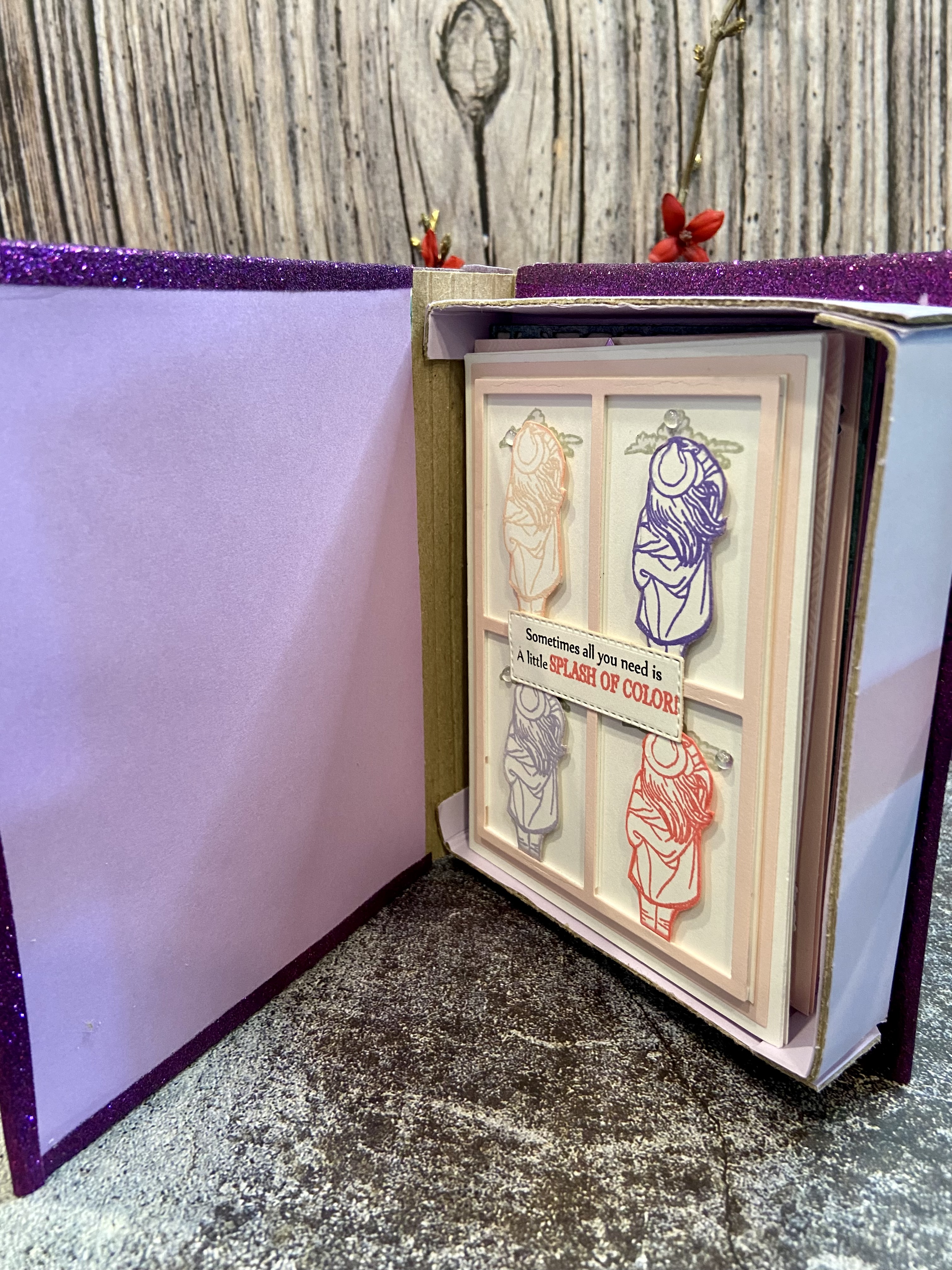
Masculine Card Set
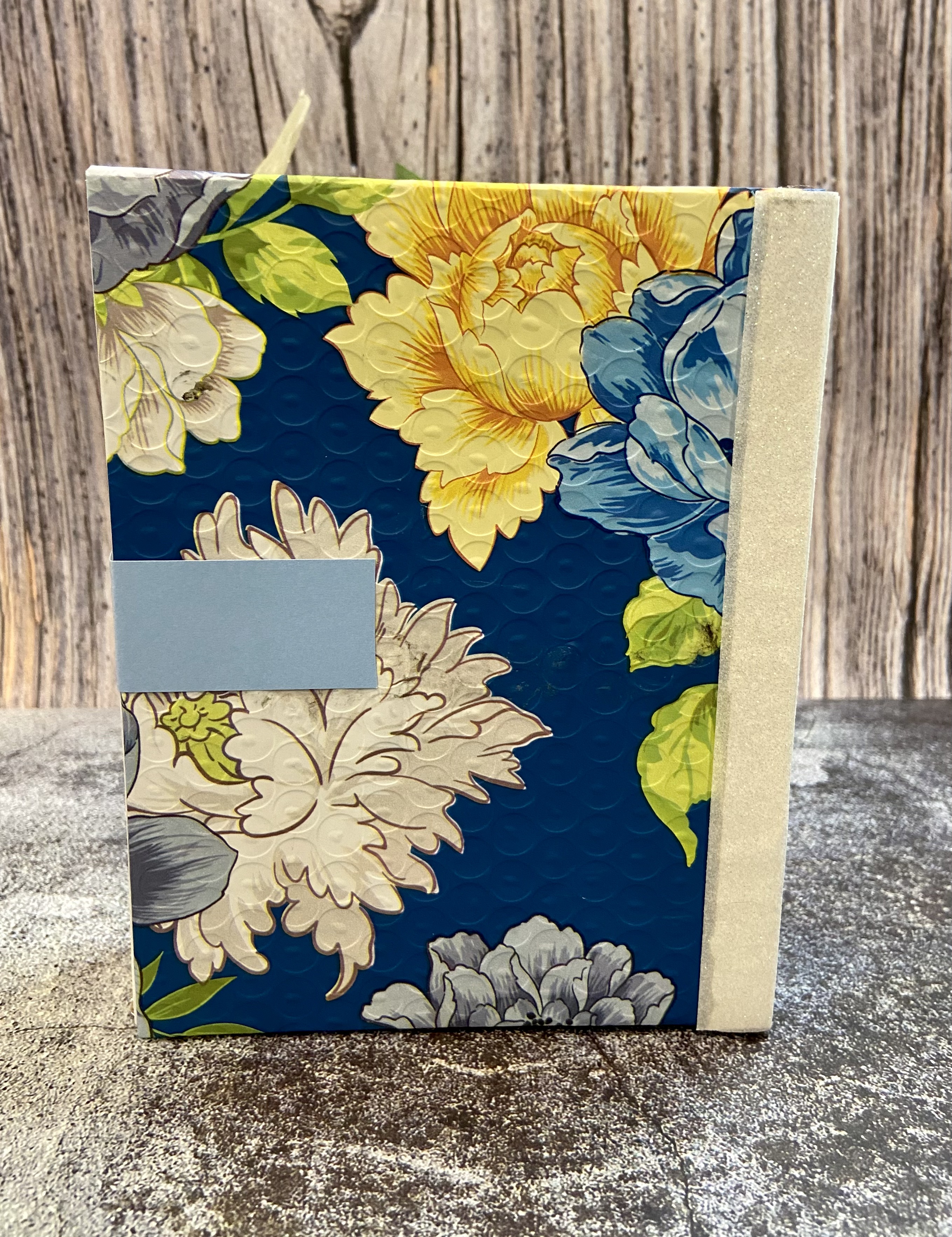
I created a set of four masculine cards and a book box for the gift packaging. I'll go into more detail about how I made the book box later on in the post. I did incorporate my recycled element into the gift packaging, and that item was the beautiful printed tyvek part of an Altenew shipping envelope. I cut the envelope open, carefully removed the bubble wrap from the back of it, and then cut the tyvek print to size. This shipping envelope is too pretty to throw out and needs to be highlighted!
So, what gives this set a cohesive look and feel? I focused on the color palette used in my gift packaging, which included blues, greens, white, and gray/silver, and used those colors throughout my card set. I started with just navy and white for the first card and then gradually added additional colors with each successive one. All of the cards also have either a white or navy base. This ties each of them together - even though the images and some design elements differ between cards, they have a similar look.
Card 1 - Happy Father's Day
Is there a more appropriate occasion for a masculine card than Father's Day? It seemed like a natural choice to me. The design that I had in mind for it was very clean, simple, and classic.
I used the following items to create it:
- the sailboat stamp from the Altenew Seas the Day Stamp Set
- Altenew Indigo Skies Fresh Dye Ink
- sentiment stamps from the Lawn Fawn Happy Happy Happy Stamp set
- frame die from The Stamps of Life
- Honey Bee Stamps Adhesive Gems
- white card stock and navy blue card stock.
The sailboat was stamped in Indigo Skies ink onto a piece of 2.5" x 3.5" white card stock, and the sentiment stamps were aligned and stamped using the same ink. I chose this size so that I could center it into the frame cut from white card stock, which I then aligned on my navy blue A2 sized card. Altenew double sided foam tape was used to adhere the sailboat panel and frame to the card base, which gives it added dimension. I thought that dimension was an important design element since the card is monochromatic, clean, and simple.
Card 2 - thanks
Hummingbirds are so unique due to their elusive nature, and that brings a sense of joy & optimism when you see them out in nature. What better way to say thanks than by sharing the joy & optimism that someone has brought to you? I again wanted a very clean & simple design for the card so as to showcase the hummingbird.
Items used to create this card included:
I started by cutting the frame die out on navy card stock. I didn't want to use all four panes of the frame and decided to snip out the vertical line going down the center of the frame so that I'd have two horizontal planes that were big enough to support the hummingbird.
The frame was centered onto a 3.5" x 4.75" white card stock panel using double sided foam tape. I then used the Water Hyacinth ink to add a little ink blending to the top half and used the Fresh Leaf ink to do the same to the bottom half. The hummingbird was stamped twice onto a scrap of white card stock using the Indigo Skies and Shadow Creek inks and then fussy cut. Double sided foam tape was added to the back of each bird and adhered to the center of each frame section. I then directly applied some Water Hyacinth and Fresh Lead inks to a scrap of white card stock using the ink cube, and cut the word thanks and its shadow from the card stock. The white card panel was centered and adhered to an A2 sized card base using double sided tape, the word and shadow were glued together with craft glue, and the word thanks was adhered to the center of the frame using craft glue. I chose to add some bling using clear sequins so that they would pick up the blue and green ink blends.
Card 3 - you got this
Sometimes you want to give a note of encouragement to a special guy in your life. This type of card can often seem too sentimental or sappy - when you just want to simply say "you got this." A butterfly is a great way to symbolize encouragement for a guy - they go through so many stages of life and end up showcasing all that they are in the end.
I used the following to create this design:
I started by stamping the Mosaic Diamonds background stamp onto a a 3.5" x 4.75" piece of white card stock. I didn't want a solid, one shade background and decided to use three shades of blue to give a more gradient look - Ultramarine, Eastern Sky, and Iceberg.
Here's a TIP for getting a gradient pattern when using a stamp: start by adding the lightest shade to the stamp first, decide where you want the gradient to start and then apply your next shade to that part of the stamp, and the last ink to be applied should be your darkest. Not only do you achieve your gradient shading, you also build up each darker shade to get a much richer blend.
My design incorporated a larger diamond towards the right side of the card, and the diamond from the Geo Frames Stamp& Die set was the perfect size for it. I stamped the diamond onto a scrap of white card stock and then cut it out with the coordinating die. I cut out an extra diamond to act as a back of the diamond. I adhered the inked diamond on top of the plain white diamond using double sided foam tape for extra dimension, put double sided tape on the back of the diamond, and placed it onto the gradient blue panel. That panel was then centered and adhered to an A2 sized navy blue card base. Next steps included: stamped my butterfly, colored it with the liquid chrome marker, cut it out with the coordinating die, stamped my leaves and cut them out with the coordinating dies. The leaves and butterfly were attached the diamond using craft glue. The final step was to create the sentiment. I used the Tanzanite ink cube and applied it directly to a scrap piece of white card stock, stamped the sentiment with silver pigment ink, and cut it out. I like how the ends of the sentiment strip have some white on them - it's kind of a more artsy look.
Card 4 - happy birthday
I decided on a birthday card for my final card in the set. I had recently purchased the Dreamy Tiles 3D Embossing folder and knew that I wanted it in my design. The tiles have an antique feel to them and I thought it would be a nice background for the card. However, I also knew that I didn't want to leave them plain . . . they needed some color to show off their beauty and dimension.
The following items were used in making the card:
The tile background was so much fun to create! I used an A2 sized piece of navy card stock aligned it with the bottom two rows of the embossing folder, and ran it through my die cutting machine. TIP: lightly mist the back of your card stock with water before using it with an embossing folder to prevent the paper from tearing or cracking. With the card panel embossed, it was time to color it. Mica sprays were the perfect medium to apply to add layers of color and shine. I laid the panel onto a piece of cardboard, used Post It Tape to adhere it down and also tape off the sections in between the tiles, and started spraying. TIP: Use the same piece of cardboard for spaying whenever you use mica sprays. Excess Spray will build up on it over time and you can spray it with water to color other pieces of card stock at a later time. It's a great way to get more use out of the excess ink! I sprayed the Pewter first to give the base a darker gray look, added sprays of Winter Frost next to add some blue hues, and then added random drops of Shiny Bauble to give an occasional lighter splash of color. The panel was dried using my heat tool. The Post It Tape was then removed and I was really happy with the resulting card background. One more TIP: save the Post It Tape that was splashed by the mica spray. You can use it in your design or another card! The card panel was then adhered toan A2 sized white card base with double sided tape.
I next cut a white frame for the card using the Taylored Expressions Frame in Frame 3 die and some white card stock, and then adhered it to the card base. I stamped, colored, and cut a flower and leaf using the Adore You Add-On stamp and die, and adhered them to the card using double sided foam tape. The final step was to create my sentiment. I cut the shadow from the words happy birthday from the saved mica sprayed Post It Tape. Such a great way to incorporate another pop of color into your design! I also cut the shadow from white card stock, and used craft glue to adhere the post it tape to the card stock. the actual words happy birthday were cut from navy blue card stock, glued to the shadow pieces, and adhered to the card using double sided foam tape.
That wraps up my overview of the masculine card set. I'll cover the creation of the box after telling your more about my feminine card set.
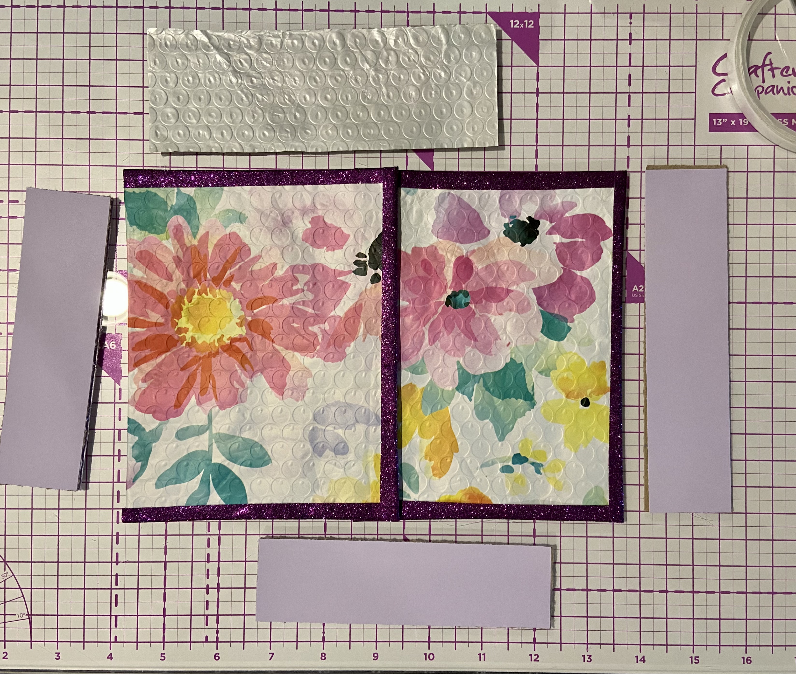
Feminine Card Set
Similar to the masculine card set, I made four cards for the feminine card set and a book box for gift packaging. I incorporated a second recycled element into the challenge by using the printed tyvek piece of another beautiful Altenew shipping envelope to adorn the packaging. This one had lots of pink, purple, and green and was a perfect choice to use as part of the feminine set. Also similar to the masculine set, I chose to tie the cards together bu using two main colors of card stock, white and pink in this case, and incorporating the colors from the packaging. I think you'll agree that this gives the cohesive look and feel.
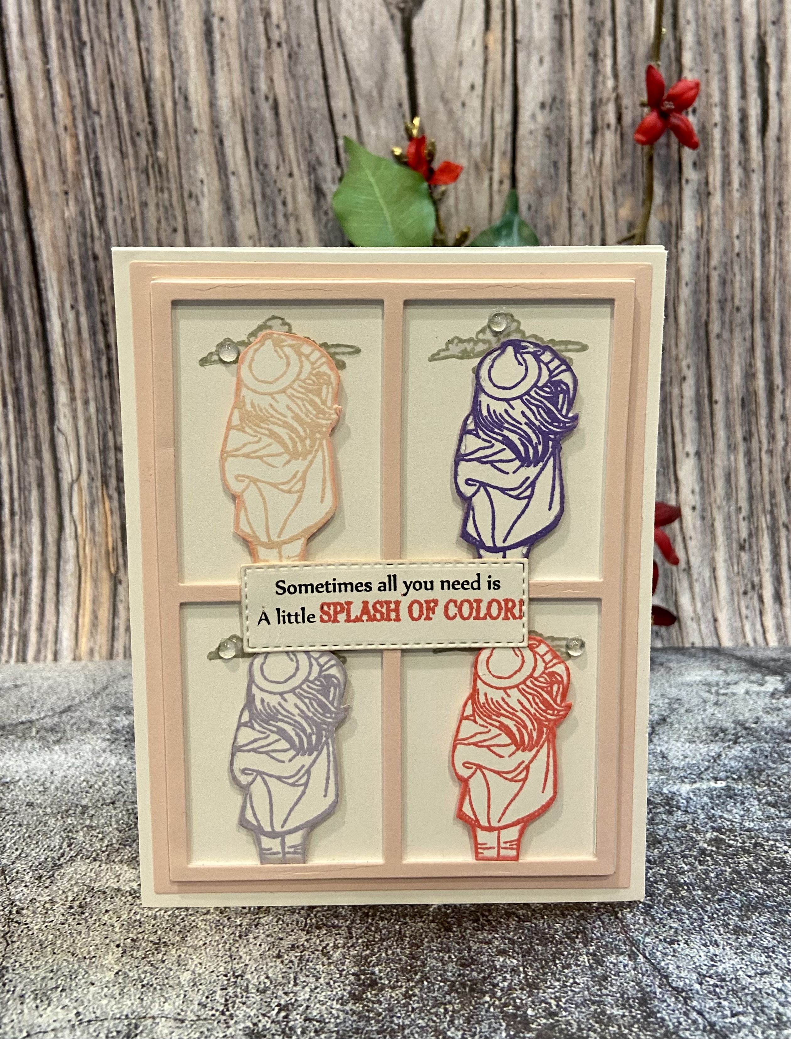
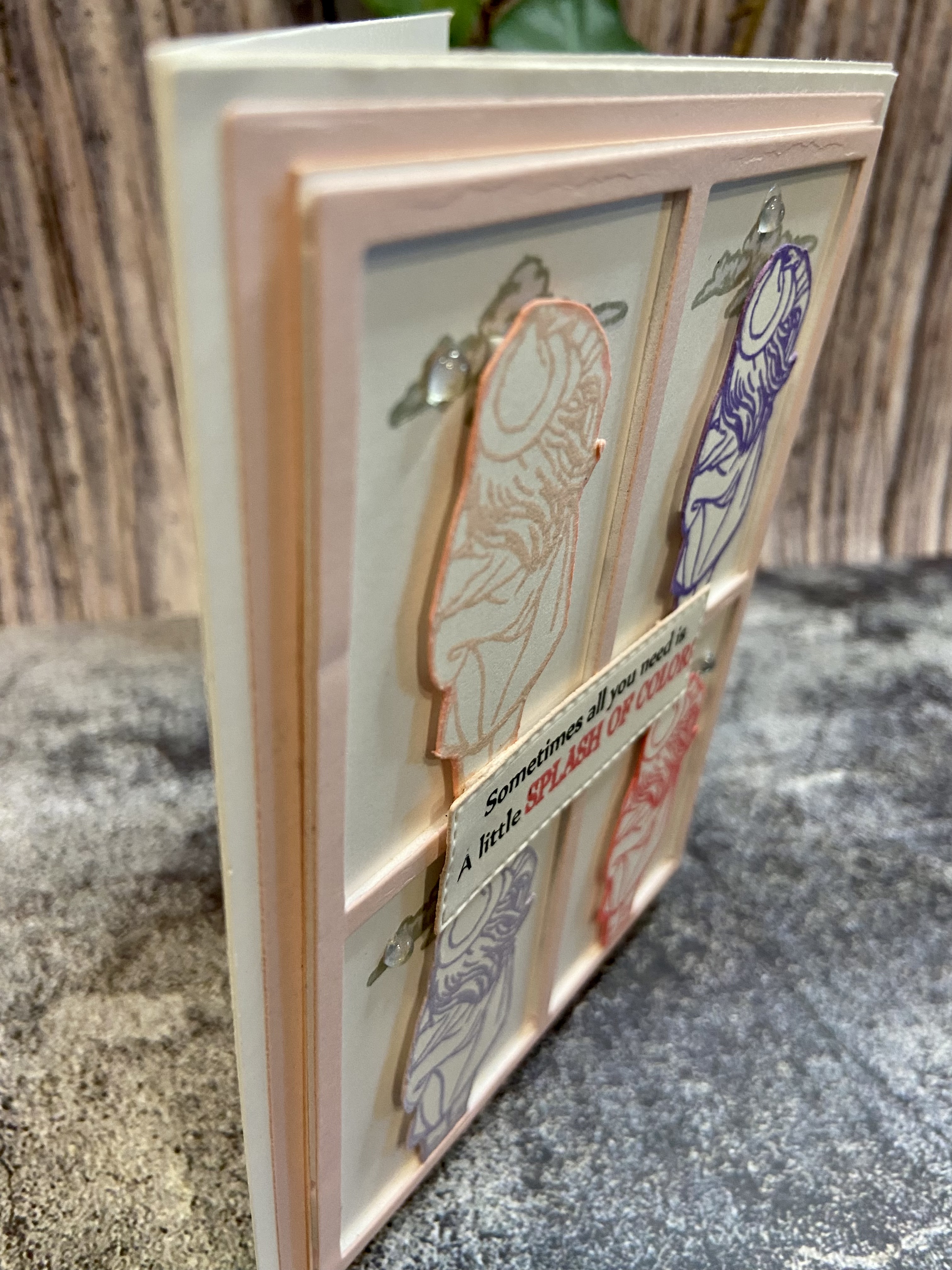
Card 1 - Splash of Color
I think that this may just be my favorite card of the set! Intended to be an encouragement or thinking of you card, the images and colors used perfectly convey visually the sentiment - Sometimes all you need is A little SPLASH OF COLOR! The design is based on the concept from the Pop Art lesson in the For the Guys course. But why limit it to just masculine cards?!
The following items were used to make it:
I used the window frame die to cut a frame out of pink card stock and adhered it to a 3.5" x 4.75" sized piece of white card stock using double sided foam tape. I then adhered that piece to an A2 sized white card base. I stamped the cloud stamp at the top of each window section using Silver Lake ink, and then colored it with the cool light gray alcohol marker. The image of the woman was stamped onto a piece of white card stock four times (using Blush, Coral Berry, Wisteria, and Hydrangea inks), and then fussy cut with detail scissors. Double sided foam tape was applied to each stamped image and then each image was placed into a window frame. I used a small stitched rectangle die to cut a strip for the sentiment and stamped the sentiment onto it using Jet Black and Coral Berry inks. TIP: when stamping a sentiment with two different colors, cover the part of the sentiment to use the second color with Post It Tape, ink the first part of the stamp, remove the Post It Tape, and then stamp it. Clean your stamp, cover the first part with Post It Tape, ink the second part of the stamp, remove the Post It Tape, and then stamp it. You'll get a perfect stamp of the sentiment using two colors! I adhered the sentiment strip to the center of the frame with craft glue. The result is a colorful, clean card that is sophisticated and the perfect way to remind someone you care for to look for those little splashes of color in life.
Card 2 - Shine LIKE A DIAMOND
I love the diamond background of the Shine Like a Diamond background stamp. It's very classy, very elegant, and looks amazing on pink card stock stamped with white pigment ink. This card may be used to let a special women or girl know that she's done an amazing job and to remember to always brightly shine.
The following items were used to make it:
The first step was to create the background. I stamped the Shine Like a Diamond background stamp onto an A2 sized piece of pink card stock using white pigment ink. I dried it with my heat tool so that the pigment ink wouldn't get smeared, applied double sided tape to the back of it, and adhered it to an A2 white card base. I took the largest diamond die from the set and cut out a diamond shaped piece of pink foil card stock. I then took the next size diamond die from the set and cut out one from white card stock. The word shine was cut from the center of the white diamond, and it was also cut from a piece of pink foil paper. I adhered the white diamond to the pink diamond using craft glue, and then inlaid the pink foil word shine into the white diamond with craft glue. Double sided foam tape was adhered to the completed diamond and it was centered onto the card base. I then stamped the sentiment LIKE A Diamond under the word shine with jet black ink, and traced over it with a black glitter gel pen. Green and pink adhesive gems were applied to the card and that wrapped it up!
Card 3 - happy birthday
Of course there has to be a floral card in a feminine set! I happened to include two. The first one showcases the Shrub Rose layering stamp set. These roses are gorgeous! I paired them with a geometric embossed background and, while perhaps as the creator I'm a bit biased, the resulting birthday card is stunning. I used these items to create it: Altenew Shrub Rose Layering Stamp and Die Set, Altenew Geo Diamonds 3D Embossing Folder, Spellbinders Thanks Enclosed Sentiment Dies, Altenew Crisp Dye Inks: Blush, Pink Pearl, Bamboo, Fresh Leaf, Shadow Creek, Hunter Green, and Jet Black, Concord & 9th Premium Dye Inks: Nectar, Grapefruit, and Honeysuckle, Sakura Black Glaze Pen, and Spectrum Noir Sparkle Clear Overlay Micro-pigment Pen.
I started by making the card base. A 3.5" x 4.75" sized piece of white card stock was misted with water and placed onto the embossing folder. I took the Pink Pearl ink cube and ran it over the opposite side of the embossing folder before running it through my die cutting machine. The result is this beautiful, pink embossed geometric design that I adhered to an A2 sized pink card base using double sided tape. Next up was to create the roses. The Shrub Rose Layering Stamps make it easy to create roses by aligning each stamp and stamping using different colors. One rose was created using Jet Black, Blush, Nectar, Grapefruit, and Honeysuckle inks. I substituted Pink Pearl for Blush in the second one. The leaves were made by using the layering stamps and Fresh Leaf, Shadow Creek, and Hunter inks. The roses and leaves were then cut with the coordinating dies. Leaves were attached to the card using double sided tape, and the roses attached using double sided foam tape. I ran the Fresh Leaf and Shadow Creek ink cubes across white card stock and then used the word dies and shadow dies to cut each from it. The word was glued to the shadow with craft glue and then glued to the card. Some sparkle was added to the roses and leaves using the micro-pigment pen, and three drip drops were attached with craft glue.
Card 4 - hello friend
My final card in the set is made of all die cut pieces - no stamps at all. My vision for the design was painted tulips against a geometric background.
The card was made using
- Altenew Craft-A-Flower: Tulip Full Bloom Layering Die Set
- Altenew Curtain Leaves Cover Die
- Altenew Versatile Greetings Die Set
- Altenew Crisp Dye Inks: Blush, Pink Diamond, Cotton Candy, Coral Berry, Fresh Leaf, and Shadow Creek
- Altenew Artist Alcohol Markers: Frosty Pink, Coral Berry, Jet Black, Parrot, and Moss
- Tim Holtz Distress Mica Sprays: Fresh Balsam and Merry Mint
- Brutus Monroe Hunter Chroma Mist
- Sakura White Gelly Roll Pen
- Spectrum Noir Sparkle Clear Overlay Micro-pigment Pen
- Taylored Expressions Bits & Pieces Clear Drip Drops
- White and pink card stock, chipboard, and vellum
I started the card with the background. I cut the Curtains Leaf cover from an A2 sized piece of chipboard and placed it onto my mica spray piece of cardboard. I proceeded to spray it with Hunter Chroma Mist, Fresh Balsam Mica Spray, and Merry Mint Mica Spray and then used my heat tool to dry it. The result is a beautiful green background that sparkles. I ran craft glue along the back background and adhered it to an A2 sized piece of vellum. I like that the vellum is a little more dull than traditional white card stock so that it doesn't detract from the green background. TIP: I used chipboard to cut the background since it's thicker than card stock and will provide some depth to the card.
Next up was using the dies to cut out the pieces of the tulips from white card stock. I did a faux water color technique to the card stock using the Blush, Pink Diamond, Cotton Candy, Coral Berry, Fresh Leaf, and Shadow Creek inks and water. I applied the inks into my glass craft surface, misted them with water, and used a paint brush to apply layers of color to the pieces. I outlined the flower petals with the Coral Berry marker and added some highlights using the white gel pen and Frosty Pink marker. I outlined the leaves and stems with the Moss marker, and added highlights using the white gel pen, Parrot, and Moss markers. This combinations of inks and markers gave a very painted look to flowers, stems, and leaves. I assembled the flowers and glued them to the card base with craft glue, added some sparkle with the micro-pigment pen, and glued down three Drip drops. The sentiment words and shadows were cut from white and pink card stock, glued together, and glued down to the card.
Another set of cards completed! Time to discuss the gift packaging . . .
Gift Packaging
I already let you know that the recycled item(s) used was the tyvek part of two different Altenew Shipping envelopes.
These prints are so beautiful and are just perfect to use in place of paper to cover my book boxes.
The structure of each book box is the same. I cut the following sized pieces of chipboard for each book box:
I then covered those pieces with similar sized pieces of the respective packaging or matching card stock:
I scored the binding piece at every 1/4” to make it flexible; scored the two short sides at 1/2” at the top and 1/2 inch at the side that will connect to form the base. Cut out the small scored square of each end and cut an angle in the opposite corner to help it form and adhere to the next piece better.
Next up was assembling the pieces using double sided tape and craft glue: formed the foundation of the box by connecting the two smaller sides to the longer side; adhered that base onto the bottom foundation piece with double sided tape and craft glue; adhered the binding to the bottom cover with double sided tape and craft glue, and then the binding to the top cover with double sided tape and craft glue. I used glitter washi tape to cover the binding and the connection to to the top & bottom covers and adhered it with double sided adhesive tape.
As you can see, the book box perfectly holds the 4 A2 sized cards and envelopes. Using the Altenew shipping packaging keeps it from ending up in a landfill (AGAIN, it is too pretty to throw out - save it!) and coordinated so well with the color palette that I chose for each set of cards.
I hope that you found this Paper Play post to be both informative and inspiring. I know it was a longer post than usual and appreciate you sticking with me! Please feel free to reach out to me with any questions you may have about the cards or packaging, or to share any thoughts on the post. Until next time . . . be well!