Monday, July 22, 2024

Sea of Dreams - Gecko Galz July 2024 Design Team Projects

Hello, friends!

Today is my day to share my design team projects for Gecko Galz.  What comes to mind when you hear the phrase "Sea of Dreams"?  Thoughts of beautiful fish sailing through the sea?  Perhaps mermaids frolicking under the waves?  July's theme for Gecko Galz Challenge was Sea of Dreams and I created some projects that were inspired by it.


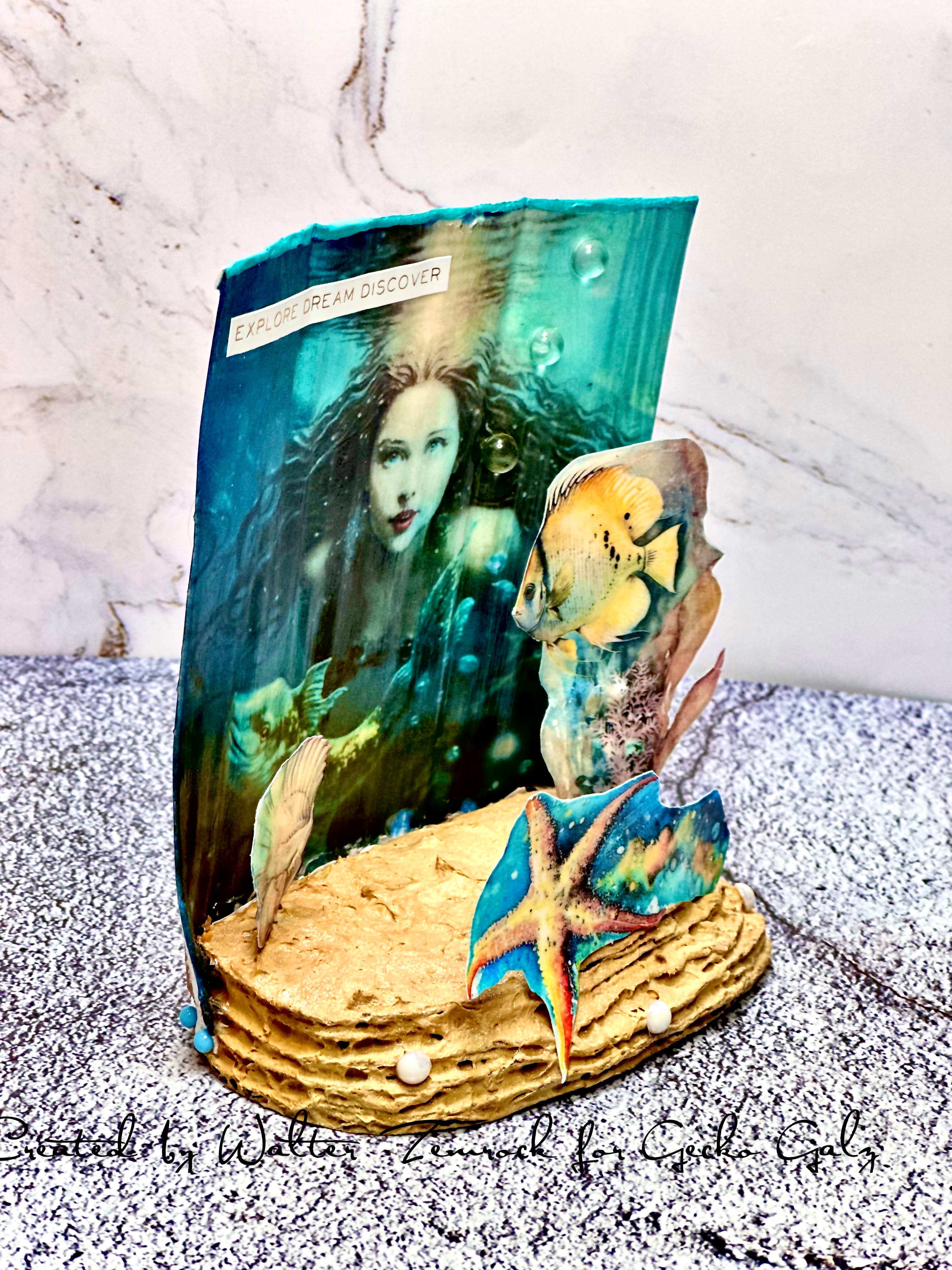
My first project is this underwater motif created with a cardboard base.  I stacked several layers of cardboard, each layer slightly smaller than the previous one, to form the base.  Each layer was glued with craft glue to the next.  I then took some embossing paste mixed with some ochre ink and painted the base.  I sized the Gecko Glaz background pic from the Oceans Blue set, printed it out, glued it to a piece of cardboard, and then applied some Prima Marketing 3D Gloss Gel to it.  This medium helps create dimensional texture on the print.  The print was attached to the back of the base with both glue and stick pins to ensure that it stays in place.  I printed out some ephemera, also applied some 3D Gloss Gel to them, glued a stick pen on back, and pushed the pin into the base.  I also put a dab of glue at the base to help secure the pin.  Last step was adhering a sentiment and some pearl gems.


The next project is my favorite.  I'm calling it a porthole card.  I created the card base by taking my largest circle die and placing onto an A2 card base.  I made sure that the top lip of the die was placed just over the fold of the card base before running it through my die cut machine.  The result was a circular card base that flips up to open.  I then made a circular frame out of white card stock using my largest circle die and the next one down to cut it out.  I applied some Ranger Tim Holtz Grit Paste around the frame.  Once dry, I sprayed it with some Tim Holtz Bronze Mica Spray, and then splattered it with some Brutus Monroe Peakcock Chroma Mist and Tim Holtz DDistress Rusty Hinge Spay to add some patina ageing to it.  Next, I chose my image from the Oceans Blue set, sized it, and printed it out.  I applied a coat of the 3D Gloss Gel and, once dry, cut out he image with my largest circle die.  I also cut a piece of acetate using the same die.  A sentiment was applied and then I put it together: background image was glued to the card base, the acetate was adhered using double sided foam tape strips, and the frame was also adhered with double sided foam tape strips.  I am so happy with the result - it truly looks like an old rusting porthole window.  And what a view when you look outside!


My third project is a fun A2 sized card.  I sized the image from the Fish Camp set, printed it, and applied a coat of 3D Gloss Gel to it.  I then sized the image of the swimmer from the Sweet Summer Days set, printed it, fussy cut the swimmer, and applied 3D Gloss Gel.  I glued the swimmer to the underwater scene and attached that card panel to an A2 navy blue card base.  I used an A2 frame die to cut a navy blue frame and attached it to the card with double sided foam tape strips.  The last step was glue down the sentiment.


My final project is a very whimsical 5x7 card.  I sized the image of the swim cap gal from the Sweet Summer Days set, printed it, and fussy cut it.  Embossing paste was applied to a wooden square (I turned it to use it in a diamond shape) and then painted with Rainstorm metallic acrylic paint from Perfect Paints.  The bubbles around the swimmer were made with a die and a medium shade of blue card stock.  I glued the bubble cut out down to the wooden diamond and filled in the bubbles with X-Small Glass Bead Gel from Perfect Paints.  I let this piece dry and then attached the swim cap gal with craft glue.  This was attached to a piece of white card stock that I water-colored with ochre ink.  The card panel was attached to an aqua card panel, and that panel attached to white 5x7 card base.  I used a darker aqua acrylic marker to outline the image on the white card stock, adhered a witty sentiment, pearl gems, and clear acrylic bubbles.  Such a fun card to share with someone who marches to her own tune!

I hope that you enjoyed learning more about these projects and the process to create them.  Thanks for spending some time here with me today.  Until next time . . . be well!  

Saturday, July 20, 2024

BPM/IBFS - A Sequined Background!

Hi, friends!

I hope that everyone is having a great summer!  Mine has been great so far.  I've been able to enjoy some time off while also keeping up with my crafting time.  Speaking of summer, today's card is a celebration of it featuring another one of the Rick St. Dennis bear stamps.  Who doesn't love spending some time at the beach?  A little fun in the sun is good for the soul - even if you're a bear!  My inspiration for the card was a picture of the bear on the beach being given to say hello to a friend.  What sets this card apart from others is that the card panel background is completely made up of sequins.  It was the first time that I've tried this and I am really happy with the results.  What do you think?


Here's what I used to create it:

 Here's how I made it:

  • Adhered turquoise card panel to card base with double sided tape and stamped the sentiment at the top.
  • Stamped the bear onto the smaller white card panel and colored it with alcohol markers, pastel gel pens, and glitter gels pens.
  • Starting at the bottom of the card, glued sequins down to the card base and worked my way up to the top: used cream, brown, and gold sequins for the sand and rocks; turquoise sequins for the ocean; light blue sequins for the sky; silver sequins for a couple of clouds; and yellow sequins for the sun.
  • Adhered the smaller panel to the card; angled the smaller panel to give it a more relaxed, whimsical feel.


I love how the sequined backgrounds almost mimics a mosaic type of look!  It's also nice that some of them are a little more flat and others are a little more shiny to break it up.  I am definitely going to try this technique again!

That's it for this post.  I hope that you continue to enjoy your summer.

Until next time . . . be well!

Sunday, July 14, 2024

AECP Level 3 - Mission: Inspiration

Hello, friends!

Welcome back to Paper Play.  Today's post is a little bittersweet because it's all about my last AECP course, Mission: Inspiration.  This class focused on using social media and other sources for inspiration for your cards and how to organize such sources. It's also the first time that I've done a card layout sketch.  I'm not a fan of card sketches - I prefer to just dive in, start creating my card, and let my intuition guide me.  While the class didn't change my mind about that, I can see where it can be a useful tool to capture ideas in a journal of ideas.

The source of inspiration for my project was a piece of art that I had recently seen on Instagram.  Here's a screenshot of it:


As you know from prior posts, I'm a huge fan of the vintage style.  Additionally, I'm a fan of the Art Deco style as well.  I have long been fascinated by the "Roaring 20's" and the history of the era.  I think it all started when I did a project on Prohibition for my 8th grade history class.  It only grew as I read classics of American literature like The Great Gatsby and Babbit.  I have created other projects inspired by this time period and style, and the above pic just called out to me as soon as I saw it.  I don't keep a written journal of ideas and, instead, take screenshots to keep in photos on my phone.  I took a screenshot of this one as soon as I saw it, and I knew immediately that Altenew's Deco Cover Die Set and Streamlined Spring Die Set would be used to create my card.  Here's the card inspired by the artwork that I created:


I'm really happy with how it turned out.  I was able to bring in the gold and black colors, the teal/peacock from her fashion and hair, and the scalloped shaped florals that are so very art deco.  I also made sure that there was a lot of depth in the card by using lots of line scoring, double stacked die cuts, and foam tape.

Here's what I used to make it:

Here's how I made it:
  • Used the largest Deco Cover die and black card stock to cut out the frame; adhered the frame to the card base with craft glue.
  • Scored the inside piece cut from the Deco Cover Die at each 1/16 measurement on my scoreboard (i.e. each line on the scoreboard); doing so adds some depth to the piece.


  • Sprayed some Antique Gold Ink spray onto my palette and sprayed some water to dilute it a bit, misted the scored die cut with some water, and then used a paint brush to apply a coat of gold to it; doing so gives it a lighter touch of gold while still allowing the black to come through.
  • Once dry, put double sided foam tape strips on the back of the die cut, aligned it with the card base, and adhered it.
  • Sprayed the white card stock for die cuts with the Peacock Chroma mist and let it dry.
  • Die cut the flowers and leaves (1 of each for each position on the sprig die and 4 extra of the large flower) from peacock-colored card stock, and two of the sprig dies from black card stock.
  • Scored lines at 1/16 on each of the four extra flowers to add more depth and make them stand out from the sprig die cuts.

  • Used the gold gel pen to add some color to the inside of the scored lines on the flower and used the white gel pen to add some highlights to the spaces between the lines; doing so softens the color, adds another element of gold, and differentiates these flowers from the one sprig.
  • Adhered a flower into each of the four inside corners with craft glue; add them at an angle to have the scored lines go in a different direction than the scored lines on the card panel. 
  • Glued the two black sprig die cuts together and colored the top one with the gold metallic marker; the stacked die cuts add more depth to the sprig.
  • Glued the flowers and leaves to the back of the sprig, adhered double sided foam tape strips to the back of it, and placed it on the card.
  • Stamped the sentiment, ran some black ink around the sides of the sentiment, and glued it in place.
  • Glued down three gold acrylic bubbles.


I really like my interpretation of the image.  The card has varying degrees of depth and color in the art deco style.  I can picture this image hanging on a wall in Gatsby's mansion as a fabulous party is underway!

I hope that you enjoyed learning about my inspiration and creative process!  My next step in this AECP journey, should this project be accepted, will be to create my course for a live session.  I already have a couple of ideas swirling around and look forward to fleshing them out.

Thanks again for stopping by.  Until next time . . . be well!


Wednesday, July 10, 2024

BPM/IBFS - A Bearable Birthday!

Hello, friends!

Welcome back to Paper Play.  Do you ever find yourself needing a quick birthday card and not having the right one in your stash?  It's nice to be able to fall back on something to help save you time when that happens - and that's the focus of today's post.  Blank Page Muse has a great digital download kit, It's Your Party, that will all will you to create a really nice handmade card.  It has a variety of papers, ephemera, greetings, and more.  I chose a paper that I really liked and paired it with one of Rick St. Dennis' adorable bear stamps.  The result is a card that is certain to make someone smile!


Here's what I used to create it:

 Here's how I made it:

  • Used the printer app for my printer to reduce the size of the digital background paper for the card (3.75" x 5") and printed it.
  • Adhered printed panel to card base with double sided tape, stamped the sentiment, and applied Glossy Accents to the balloons on the panel to give them texture and make them shine.  TIP: use a heat tool on low or a hair dryer to speed up the drying time of the glossy accents!
  • Stamped the bear onto white card stock; colored the image with a mix of alcohol markers, pastel gel pens, and glitter gel pens; fussy cut the image.
  • Adhered the bear to the card with a Wobbler Action Spring, which gives the bear some motion when tapped.
  • Placed two rows of rainbow gems under the sentiment.


Such a quick way to make a colorful and fun birthday card!

I hope you enjoyed this post and my tips for making a beautiful card in no time at all.  Let me know what you think!  I'll be sharing another card featuring a Rick St. Dennis bear in my next post.  Stay tuned!

Until then . . . be well!


Saturday, July 6, 2024

AECP Level 3 - Elements of Floral Composition

Hi, friends!  Welcome back to Paper Play.

It’s been really hot and humid in New England this past week, so it was the perfect time to stay indoors in the air conditioning and get crafty!  I took the opportunity to finish my 4th AECP Level 3 class, Elements of Floral Composition.  Jaycee Gaspar taught this very informative course on all of the elements of composition, including: color, value, line, shape, form, texture and space.  Jaycee did an amazing job with breaking it all down and showing exmples of taking each component into your design.

I chose to focus on color, value, line, and space with the project that I created.

Time to Celebrate

I really enjoy ink blending florals and knew that I wanted my main project to incorporate it.  I also knew that I wanted to have lots of depth to play around with space and would use die cut florals to achieve it.  I decided to go with the Altenew Flowering Dogwood Layering Die Set because it checked the boxes and is my favorite layering die set.  I adhered to the 60/30/10 color ratio focusing on pink, white, and green.  As you can see, there are light hues with the pinks, and darker hues with the greens (value).  I used darker shades to emphasize the natural lines of the flowers and leaves, and also added a light white line next to the embossed lines to help give the, direction.  Lastly, I used several flowers and layered them across a wide swath of card to to best utilize space and not have a ton of white space.


Here’s what I used to make it:

  • Altenew Caft-a-Flower Flowering Dogwood Layering Die Set
  • Altenew Lovely Camellias Outline Stamp Set (sentiment)
  • Altenew Fresh Dye Inks: Blush and Rouge
  • Altenew Crisp Dye Inks: Green Fileds and Hunter Green
  • Altenew Artist Markers: Pink Cloud, Swamp Green, Evergreen
  • Altenew Jet Black Ink Spray
  • Sakura White Gelly Roll Pen
  • Taylored Expressions Bits & Pieces Black Rhinestones
  • A2 white card base
Here’s how I made it:
  • Used a black ink pad to outline the card base
  • Die cut all leaves and florals using white card stock
  • Blended the florals with Blush ink first and then Rouge


  • Used the Pink Cloud marker to add depth to the embossed lines on the petals

  • Added light white lines along the embossed lines to give direction

  • Colored the leaves with Green Fields and then Hunter Green inks; used the Swamp Green marker to deepen the embossed lines of the leaves

  • Colored floral centers with Swamp Green marker and then added center dots with the Evergreen marker
  • Assembled the flowers; used the white gel pen to add some shading in the flower centers

  • Before glueing down to card, arranged leaves and flowers to decide where to stamp sentiment; stamped sentiment, masked it, and add splashes of black ink to card base
  • Once black splashes were dry, adhered leaves down with craft glue; adhered flowers with double sided foam tape to create further dimension

  • Glued down three black rhinestones
Here’s a closeup of a flower to show how the light white lines help to further define with the direction of the petals:


This was a really fun card to make and I believe that it provides a great example of what I learned in this class.  I feel more confident with my florals since I know understand more of the theory behind composition and arranging.  Thanks, Jaycee, for another amazing course with Altenew!

Thar wraps up this post.  Thanks for spending some time with me today on Paper Play.  Until next time . . . be well!

Dandelion Wishes - Tuesday Morning Sketches #772

Today’s card for Tuesday Morning Sketches is a simple reminder to keep dreaming and stay true to yourself.  As kids, we would pick a dandeli...